- Installation manual
- Do you need help?
- General
- Save and create restore point
- Tabs
- Rules
- First an overview of the Rules tab
- Individual rule setup
- Optional fields
- Required fields
- Visible fields
- Hidden fields
- Editable fields
- Read-only fields
- Visible tabs
- Hidden tabs
- Hidden headings or elements
- Hidden headings or HTML
- Hide edit item or save item button
- Run these functions
- Display this message
- Alert this message
- Send or stop these E-Mails
- Selected tab index (or Tab unique ID)
- Set field value
- Controls in the bottom right corner
- Expand and collapse
- Field tooltip
- Field CSS
- Side-by-side
- Misc
- E-Mail and Print
- Fields
- Custom JS
- Custom CSS
- vLookup [plugin]
- Autocomplete [plugin]
- Cascading dropdowns [plugin]
- Resource management [plugin]
- Help
- Export, import and restore
- License
- Direct backend access
- DFFS Load time tracker
- Tips and tricks
- DFFS_Email list with workflow
- MUI support
- Change loading overlay text / image / HTML
- Share the form configuration between multiple forms
- Using different DFFS configurations in the same form
- Load license code from file
- Change log
Last updated: May 10, 2020.
Installation manual
You find the installation manual here.
Do you need help?
Search the forum for a solution, or post a new question if you cannot find the answer. You find the forum here: https://spjsblog.com/forums
General
Dynamic Forms for SharePoint (DFFS) is a solution that lets your customize out of the box SharePoint forms to create powerful rich and dynamic forms without using code, or accessing the backend of SharePoint.
Because it is 100% client side, you don’t have to involve your server administrator to set it up – all you need is “Design” or “Owner” rights to the SharePoint site you want to set it up in.
By using the graphical user interface, you can customize the layout using headings or custom HTML, tooltips, tabs or accordions. You can arrange form fields side by side, and you can add triggers and rules to control which fields are visible, hidden, read-only or required.
You can also show different form fields or tabs for different users by targeting SharePoint user groups.
When you enter the DFFS backend from a SharePoint form, you have many options for customizing the form. I will go through all the settings for the different tabs describing the base functionality and adding examples where necessary.
Tip: Click the question marks to make them stick to be able to copy text from them.
Save and create restore point
When saving the form with this button you make a backup that you can later restore into one of the forms in the same list.
The restore functionality has been put in a new tab “Export, import and restore” along with the Export and import functionality that has been moved from the Misc tab.
Please note that you can only restore configurations saved after upgrading to v4.4.3.0.
Tabs
This is where you build the tabbed form. You can leave this empty to show all fields in the form, but a tabbed form will make the form easier to navigate, and you don’t need as many rules.
You can add as many tabs as you like, and you can control how the tabs are wrapped in multiple lines by using the “Number of tabs in each line” setting in the Misc. tab.
To create a tab that shows all the fields, leave the “Visible fields and heading” field empty.

Tab unique ID
This lets you use a friendly name you can use to refer to this tab in rules.
Tab name
This is the visible label of the tab. This value can be a plain text or HTML.
See “MUI support” section for instructions on how to use JSON string format so support multiple languages.
Tab title
This is the title attribute shown when you hover over the tab. This is restricted to plain text only, but you can use MUI as for Tab name.
Tab color override
If you like to set a specific color for this tab, you can use a named color, hex or rgb:
Named color
red
Hex color code
#ff0000
RGB
rgb(255,0,0)
This will hide the tab, but the tab contents is still available if you “select” this tab. Use this setting if you use another rule to show this tab, or you use accordion functionality on the headings and do not want the tab itself to render.
Check this box to hide the “Edit item” button by default in this tab. This setting applies to DispForm only, as this is where the “Edit item” button is found.
Check this box to hide the “Save item” button by default in this tab. This setting applies to EditForm only, as this is where the “Save item” button is found.
Which group can see this tab?
Click “Add group” to select one or more SharePoint groups that should see this tab. If specified, this tab is hidden from those not member in one of the selected groups.
Unfortunately, DFFS cannot look into AD groups, and the users must be members of the group “in person”.
Click function name
If you want to trigger one or more function when selecting this tab, enter the function names without the parentheses here. Separate the functions with comma. Ensure the functions are available in the page by adding them to the Custom JS tab.
When you call the function, the “unique ID” is included as an argument to the function like this:
// Add this to the Custom JS section
 function clickMyTab(id){
 alert("Selected tab: "+id);
 }
Visible fields and headings
Add field
Here you can select among all the visible fields for the form. You can use the same fields in multiple tabs, but you cannot use the same field multiple times in the same tab.
If your list has content types enabled, you will be able to select from all the available fields, but based on the selected content type, only the fields that are in the content type will show in the front-end form.
Side-by-side
Use this setting to arrange multiple fields side-by-side in the form. Use the same numeric index (like 111 for the first side-by-side-group, and 222 for the second) for the fields you want to show on one line side-by-sider. If you want to show the label, specify the label position by using the dropdown.
See the Side-by-side tab for more settings.
Use the “Header ID” to move a header above the side-by-side column.
Add headings and Add HTML section
You can add HTML code in-between the fields by selecting “Add heading” or “Add HTML Section”.
There are not all that much difference, but when using accordion functionality, the HTML section will by default collapse with the accordion, but the heading will not (unless you exclude it from the accordion in the accordion setup tab).
Hover over the question mark icon for each of the options to read the details.
This value can be a plain text or HTML.
See “MUI support” section for instructions on how to use JSON string format so support multiple languages.
Please note that you cannot add two headings after one another and hide one with a rule because then expanding and collapsing the topmost heading will have no effect on the fields below because the second (hidden) heading will control the expanding and collapsing of the fields.
CSS or ClassName for styling headings
Use CSS formatting or Class names like tabH1 or tabH2. You can create your own class by adding it in the Custom CSS in the “Field table, Custom JS and CSS” tab.
Expand / Collapse
You can enable expand / collapse to show or hide all fields below this heading. You can have the section either expanded or collapsed by default. If you set it to “off”, the heading will be collapsed with the previous heading. You find more settings in the Expand and collapse tab.
Use this code to add a button to the form:
<input type="button" value="DFFS Example button" onclick="myCustomFunctionName();return false;">
The function in the “onclick” property must exist in the Custom JS section in the “Field table, Custom JS and CSS”. tab, or in the CEWP.
Add ALL fields
Use the button “Add ALL fields” to add all the fields in the current list to this tab.
Controls in the bottom right corner
Use “Clone” to copy the current tab.
Use “New” to add an empty tab below the current one.
Use “Delete” to remove the current tab.
Use “Up” and “Down” to rearrange the tabs.
Use “Move to index” to move the rule to another index in the form.
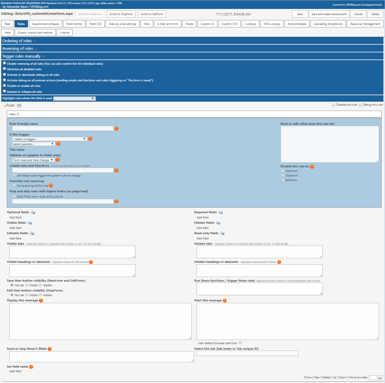
Rules
This is where you configure all the dynamics for the form using triggers and actions.
Please note that you must set all fields as optional in the list settings when you start using DFFS. You can control required and optional fields with rules, but these will not work as expected if the fields are required from the list settings.
First an overview of the Rules tab
In the following, I will go through all the settings found in the rules tab.
Ordering of the rules
You can order the rules as you like, but keep in mind that you cannot check the state of a rule that has not run. This means that any rule you refer in the “Linked rules and functions” field must be placed above the current rule.
Please note: the rule configured for the trigger “The form is ready” will always execute last – even if you place it at the top of the list of rules.
Disable reversing of all rules
Some of the triggers will reverse the rules if the conditions are not met. Hover over the question mark to the right of the trigger select to see details on the current trigger. Use this setting to prevent the rules from reversing.
Here is what happens:
• Mandatory fields > optional.
• Optional fields > mandatory.
• Visible fields > hidden.
• Hidden fields > visible.
• Visible headings > hidden.
• Hidden headings > visible.
• Editable fields > read only.
• Read only fields > editable.
• Hidden tabs > visible.
• Visible tabs > hidden.
• A hidden edit item or save item button > visible.
You can disable this reversing globally, or for each individual rule in the rules tab in the backend.
Minimize all disabled rules
Use this checkbox to minimize all disabled rules.
Activate or deactivate debug on all rules
Use this checkbox to toggle debug on all rules.
Activate debug on all presave actions
Use this checkbox to activate debug on sending emails and functions and rules triggering on “The form is saved”.
Disable or enable all rules
Use this checkbox to toggle “Disable this rule” on all rules in the form.
Expand or collapse all rules
Use this checkbox to expand or collapse all rules in the form.
Highlight rules where this field is used
Use this select to find any rules where the selected field is used.
Individual rule setup
Debug this rule
This adds a textarea below the form so that you can “see” the rule as is triggered. Use this to tweak your rules, or to figure out why your rules misbehave. You can turn on and off debug for individual rules, or toggle all with the “Toggle all rule debug checkboxes”.
Disable this rule
This disables the rule. You can turn this on and off for individual rules, or toggle all with the “Toggle all rule disabled checkboxes”.
Rule Index
In the top left corner, you find the index of the rule. This index indicates the order of execution in the front end. To change the index you must move the rule up or down by using the buttons in the bottom right corner.
Rule friendly name
This is the unique ID of the rule. If you want to address a rule from another rule, this is the preferred ID to use. You can also use the “Index”, but this will change if you rearrange the rule order.
If this trigger
This is where you select the trigger for your rule. You can choose from many list fields, but some special fields will not show in this list. Post a question in the forum if you have questions about a possible trigger field.
Fields
When you select a field, you can hover over the question mark to the right of the dropdown select to get instructions for that specific field type.
When using form fields as triggers, the rule will be evaluated both when the form is loaded, and when the field value is changed.
Other
Selected tab index
Rules are evaluated every time the user select a tab that the rule targets.
Custom JavaScript function
Use a custom function as a trigger. Put this function in the Custom JS section, and use the function name in the “This value” field. The operator is not used.
Ensure the function returns a boolean value (true or false).
This trigger will work on load only, but it can be triggered manually by another function – see “Trigger rules manually” above.
Workflow status (BETA)
Check the status of a workflow on the current item
Add the internal name of the workflow column (see Field table tab), and the target value in the “This value” field on this format:
NameOfColumn:TargetValue
You can add multiple values in the “TargetValue” separated with a pipe character like this: NameOfField:1|3
SP2013 platform workflow
You must set the status using the “Set Workflow Status” action in the workflow to have a status to check.
SP2010 platform workflow
The status is a number – not text. Here are some of the possible values:
- NotStarted = 0
- FailedOnStart = 1
- InProgress = 2
- ErrorOccurred = 3
- StoppedByUser = 4
- Completed = 5
- FailedOnStartRetrying = 6
- ErrorOccurredRetrying = 7
- ViewQueryOverflow = 8
Linked rules and functions
This will check the status of rules or functions in “Linked rules and functions” only. The “operator” and the “This value” fields are not used.
No trigger (must be triggered manually)
This rule does not have any automatic triggers, and can only be triggered from another rule (using “Run these functions / trigger these rules”) or by a custom function (see “Trigger rules manually” above.
Triggers on load
You find various triggers under this heading, but common for all is that the rule are evaluated on page load, and they will not be reevaluated until you load the form again.
The ruled are intended used for showing or hiding fields or tabs based on group membership or “assigned to” etc.
You can however use these rules in combination with other rules – look at “And these rules or functions = true” below.
Triggers on save
Currently you have only one option here. This trigger will only affect “Set field value” and “Run these functions / trigger these rules”.
By linking rules together, you can for example have this rule set a field value only if the person in the “Assigned to” field edits the item. See “And these rules or functions = true” below.
Operator
There are different operators available for the different trigger types. When you change the trigger, this field will be reset with the currently available options.
This value
This field adapts to the trigger type, and is either a text field to type into, or a choice list when using choice columns as triggers.
Validate on
This lets you control whether the rule is validated on form load, fields change or both.
Linked rules and functions
When parent rule is validated on load
Rules with lower index than the current rule, and custom functions will be evaluated. Reorder rules if necessary.
When parent rule is validated on change
The “last run status” of the linked rules will be checked, and custom functions will be reevaluated.
Checking a custom function
To check the result of a custom function, use the name of the function without parentheses. You can combine custom functions with indexes or friendly name of other rules.
Checking multiple rules
Separate indexes or friendly name with comma to use [and]. Separate indexes or friendly name with pipe to use [or].
Example
Rule1,Rule2,Rule3|Rule4
In this example, Rule1 and Rule2 must be true, and Rule3 or Rule4 must also be true for the overall result to return true.
True or False
To check the opposite value of a rule, use ~ in front of the rule or function name like this:
~RuleNumber1
If originally “RuleNumber1” returned true, the value returned from this check will be false – and vice versa.
Let linked rules trigger the parent rule on change
Use this setting to let each of the linked rules invoke the parent rule. If all of the linked rules are evaluated to true, the parent rule will be triggered.
Note to self: what does this rule do?
Use this field to remember what this rule does.
Disable this rule in
Use these settings to disable the current rule in the selected forms. This can be handy when you copy a configuration from one form to another, and don’t want to reconfigure the rules.
Please note that you cannot use the “product” of a disabled rule in “Linked rules and functions” of other rules.
Also note that when you have copied the form, the configurations are saved individually and changes made to one form will not apply to other forms.
Optional fields
Select fields to make optional when you trigger the rule.
Required fields
Select fields to make required when you trigger the rule.
Visible fields
Select fields to make visible.
Hidden fields
Select fields to hide.
Editable fields
Select fields to make editable by undoing read only setting.
Read-only fields
Select fields to make read only.
Visible tabs
Add the friendly name or the index you want to show, comma separated. You find the friendly name in the top left corner of the tab configuration like for the rules.
Hidden tabs
Add the tab friendly names you want to hide comma separated. You find the friendly name in the top left corner of the tab configuration like for the rules.
Hidden headings or elements
Add the unique ID for the heading or HTML section you want to show comma separated. You find this ID in the heading or HTML section in the “Tabs” tab.
Hidden headings or HTML
You can use “Header ID” from “Tabs”, “SBS-LabelID” from “Side-by-side”, or any valid element ID from the DOM in the page comma separated. You find this ID in the heading or HTML section in the “Tabs” tab.
Tick the checkbox to have the rule hide the edit or save item button.
Run these functions
Add a comma-separated list of functions to execute. Add the names without parenthesis. The rule will pass the “Rule friendly name” as argument to the custom function. This way you can use the same custom function for more than one rule.
Here is an example:
myCustomFunction(ruleID){
    alert("This function was triggered by \""+ruleID\"");
}
These functions must exist in the page where the form is loaded. Either add the function to the CEWP, or use the Custom JS section in the “Field table, Custom JS and CSS.” tab. Read more on this below.
Display this message
Print this message in the form. If the trigger is a field, it appears below that particular field. If the trigger is not a field, the message appears in the top of the form
This value can be a plain text or HTML.
See “MUI support” section for instructions on how to use JSON string format so support multiple languages.
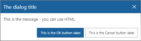
Alert this message
This message appears in a dialog.
This value can be a plain text or HTML.
See “MUI support” section for instructions on how to use JSON string format so support multiple languages.
Please note that the custom DFFS dialog is not “blocking” other scripts, so if you need a message box that stops the execution of other scripts, you must use the default browser alert box.
If you need to control what happens when the button is clicked, you can have the rule call a custom function from “Run these functions / trigger these rules” and put this in the Custom JS:
function myCustomAlertFunction(){
 spjs.dffs.alert({
 "title":"The dialog title",
 "msg":"This is the message - you can use HTML",
 "ok":function(){
 alert("You clicked the OK button - add you custom OK button code here.");
 },
 "okBtnLabel":"This is the OK button label",
 "cancel":function(){
 alert("You clicked the Cancel button - add your custom Cancel button code here.");
 },
 "cancelBtnLabel":"This is the Cancel button label"
 });
}
If you prefer using the default browser alert message box, check the “User default browser alert box” checkbox.
Build custom input forms
Using the new alert functionality you can build custom input forms to collect input form the user. You can add all kinds of HTML – like input fields and buttons that call your custom functions in the Custom JS textarea.
The syntax you use if you wan to invoke a dialog from your own code (within your DFFS enabled form) is simple.
To control the width of the dialog, wrap the “msg” in a <div> with a set width like this:
<div style='width:350px;'>Your text or HTML</div>
Close the dialog
This code will close the dialog.
spjs.dffs.closeDlg();
Send or stop these E-Mails
Configure E-Mail templates in the “E-Mail and Print” tab, and use the “E-Mail Template ID” in this field. Separate multiple template ID’s with comma.
The E-Mails will be set up in a “send on save” array, and processed when the form is saved. The emails are removed from the “send on save” array in case the rule is reversed. This means you don’t need to stop it with another rule in the current form in case this rule is undone (reversed).
Stop pending E-Mail
Please note that this only applies if you use a workflow for sending the emails (by checking the “Use custom list with workflow to send E-Mails” in the top of the “E-Mail and print” tab in DFFS backend. This is because the other email sending option (REST) cannot prepare emails for sending in the future.
This functionality is used if you for example have set up an email to be sent on the tasks due date, but you are now editing and closing this task and want to prevent the “Task_is_overdue” mail to be sent when the task passes due date.
To stop an already pending email from triggering, add the “E-Mail Template ID” like this:
stop:TemplateID
Separate multiple template ID’s with comma.
Selected tab index (or Tab unique ID)
Use this field to specify the selected tab by its index.
Set field value
You can set most field values using this action. When you edit the configuration, you can hover the mouse over the question mark to see the available options to use in the “Value” field.
Plain text
Write the text you want to use.
Get field value from another field
To copy the value from another field in the current list item, use this format:
{FieldInternalName}
You find a list of all the FieldInternalNames at the bottom of the “Field table, Custom JS and CSS” tab. Please note that you cannot use {ID} in NewForm.
Timestamp
You can use {timestamp} to insert a timestamp. To control the format of the timestamp, enter it like this:
{timestamp[dd.MM.yyyy hh.mm.ss]}
Current user (from current site)
You have different options for getting the user information from the current user.
Please note that this is the user information stored in the user list in the site collections, and not the user profile service.
Use {currentUser} for the user display name, or {currentUserEmail} for a mailto-link like this:
<a href="mailto:example@contoso.com">User Display Name</a>
To get the email as a string, use
{currentUser:EMail}
You can access custom properties from the user list like this:
{currentUser:prop}
Where “prop” is the FieldInternalName of the property from the user list in SharePoint. You can add any property FieldInternalName you like here.
User profile
To read a property from the user profile, use
{userProfile:prop}
Where prop is the profile property name. To see all user profile properties, write this in the developer console (hit F12 > Console):
spjs.utility.userProfile();
Append and prepend to a textfield
To append or prepend text to a single or multiline text field, prefix the “Value” with “prepend:” or “append:” like this example:
prepend:{timestamp}: This is a comment made by {currentUser:Title}\n************\n
The output in a multiline plain text field will be like this:
 August 16, 2015 19:50:00: This is a comment made by Alexander Bautz
 ************
If you want to append to a multiline rich text field, use <br> instead of \n for linefeed.
Date columns
For date columns, you can use [today]. You can also offset the date like this:
[today]+14 or [today]-14.
Query string value
To get the value from an URL query string, use {url:key} where “key” is the keyword from the URL like this “MyUrlKey” in this example:
…/lists/dffsdev/newform.aspx?MyUrlKey=Write this value to a field
Basic calculations
calc:{NumCol1}*{NumCol2}/{NumCol3}
You can use the operators +, -, * and /. Please note that no advanced calculations with parentheses or other math formats is supported. If you need more complex calculations you must use a custom function.
Only if the field is empty
Check this box to prevent setting the value if the field already has a value.
Controls in the bottom right corner
Use “Clone” to copy the current rule section.
Use “New” to add an empty rule section below the current one.
Use “Delete” to remove the current rule section.
Use “Up” and “Down” to rearrange the rule sections.
Use “Move to index” to move the rule to another index in the form.
Expand and collapse

You can use the “Expand or collapse each section individually” to have the hadings as an accordion where only one heading can be expanded at at time, or all headings expand and collapse individually.
The “Animation duration” field sets the slide-down and slide-up duration.
In the “Accordion header CSS style of Class” field, you can override the individual header CSS or ClassName from the heading in the tabs. I have included one example style: accordionHeading. To add more, look at the CSS for “accordionHeading” in DFFS_frontend.css.
Field tooltip

Use this tab to set a custom tooltip for individual fields in the form.
This value can be a plain text or HTML.
See “MUI support” section for instructions on how to use JSON string format so support multiple languages.
The default icon used for the tooltip is this: 
To override the default icon, add the URL to an image in the “Path to custom image for triggering the tooltip”.
You can also change the background of the tooltip container by adding a named color, hex or rgb value.
Please note that you cannot use the enter key to add linefeeds if you are writing a HTML formatted tooltip. Use a continuous text string and use <br> for linefeed.
Get tooltip configuration from
Use this option to share the tooltip configuration with another form in the same list. You can also use this to pull in the current configured values from the other form by selection another form, and then flipping back to “the current form”.
Field CSS
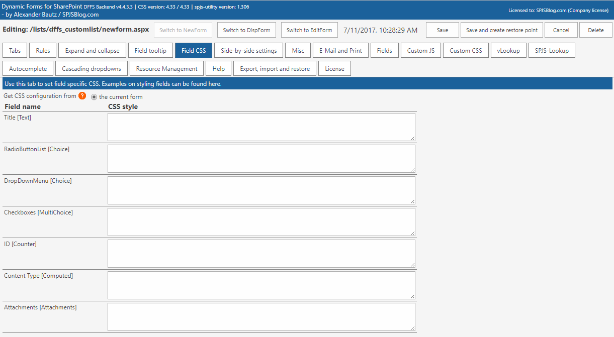
By default, the CSS applies to the <td> elements – both the field label and the field body.
You will find some examples on how to style the fields linked in the top of the tab.
If you want to create general CSS styles that apply to for example all input fields in a form, use the Custom CSS tab.
Side-by-side
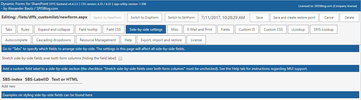
Configure the side-by-side fields in the Tabs tab, and use these settings to control all instances of side-by-side fields.
The first field in a side-by-side group acts as placeholder for the rest of the fields.
Use “Stretch side-by-side fields over both form columns” to remove the label column entirely, and stretch the form body <td> over both the columns.
Use the custom side-by-side label to add a custom label to one or more side-by-side sections. You can span the label over multiple side-by-side blocks by specifying a comma-separated list of indexes in the SBS-index field.
This value can be a plain text or HTML.
See “MUI support” section for instructions on how to use JSON string format so support multiple languages.
Misc
This tab contains various settings. See information in each section. Please note that not all settings apply to all forms.
E-Mail and Print
Use this tab to set up email templates for use in this form. Hover over the question marks to get details on each option.

Use custom list with workflow to send E-Mails
This is the mandatory for SP 2007 and 2010, but is optional for SP 2013. Please note that SP 2013 users will not be able to send E-Mail to users outside the organization without using this option.
To verify that the DFFS_Email list has all the required fields, toggle this checkbox off and on again.
Please note that any changes to the workflow must be done manually in SharePoint Designer. Read more here.
E-Mail active tab
This feature is only available in DispForm.
The will show a button to E-Mail the currently visible tab.
Important notice for SP2013
The E-Mail address in the “To” field must be a valid user within the organization. The “Cc” fields can be used to send outside the organization.
Hide from E-Mail
To hide a HTML section from the E-Mail, add the class “dffs_noEmail” to the tag – like this:
<span class="dffs_noEmail">Add your custom HTML here.</span>

Print active tab
This feature is only available in DispForm.

The will show a button to print the currently visible tab.
Hide from printout
To hide a HTML section from print, add the class “dffs_noPrint” to the tag – like this:
<span class="dffs_noPrint">Add your custom HTML here.</span>
E-Mail templates for use with DFFS rules

E-Mail Template ID
This ID is used when calling an E-Mail from a rule. This value must be unique in the current form.
Trigger E-Mail manually
Add this to a HTML section to send an E-Mail manually:
<input type="button" onclick="spjs.dffs.processEmailTemplate('TemplateID')" value="Send E-Mail">
Stop pending E-Mail
Use this code to stop a pending e-mail:
spjs.dffs.processEmailTemplate('stop:TemplateID')
Send date [optional]
Leave empty to send immediately. Please note that using this option is only available when the “Use custom list with workflow to send E-Mails” option is checked, and you have rigged the workflow in the “DFFS_EMail” list like described in the user manual.
This will pause the workflow for the specified number of days from [today], or to the date in the specified field with any offset is reached.
User [today] + any number to delay the sending of the email this number of days like this: [today]+5
You can also use the FieldInternalName of any date column in the current item in curly braces like this: {DueDate}. You can offset the send date by appeding a number perfixed with plus or minus like this: {DueDate}+14 or {DueDate}-1
Recur interval [optional]
Use this setting to have an email recurring on a set interval. The setup of the custom list and workflow required for this functionality will be posted soon as soon as someone requests it.
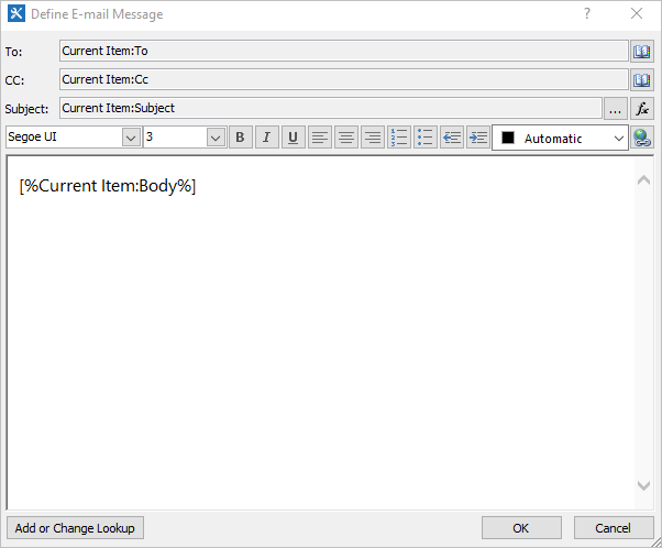
To, Cc and Bcc
You can use the current value from a people picker by using the FieldInternalName in curly braces like this: {NameOfField}. Use {currentUserEmail} to send to the currently logged in user, or type in the E-Mail address. Separate multiple entries with comma.
Please note that SP 2013 cannot send to E-Mail addressess outside your organization unless you check the “Use Workflow E-Mail”.
Bcc can only be used with SP2013, and only when “Use Workflow E-Mail” is unchecked.
Subject and Body
This value can be a plain text or HTML. See help tab for instructions on activating MUI support.
You can use the current value from a field in the message by using the FieldInternalName in curly braces like this: {NameOfField}.
Body
Use {viewItemlink} or {editItemLink} in the Body to insert a link to the current items DispForm or EditForm. You can wrap it in an anchor tag like this: <a href=”{viewItemlink}”>Link to item</a>
Please note that the “itemlink” will NOT link directly to the item if you trigger the e-mail from NewForm (no ID exist yet). The link will instead go to a filtered list view. Look here for a workaround.
Entering HTML
If you use the enter key to add a linefeed, this will be a <br> in the E-mail body. To prevent this, write the HTML code as a continuous text string.
Notification when email has been sent
This value can be a plain text or HTML. See help tab for instructions on activating MUI support. The message will be shown in the notification area when the email has been sent.
Fields
This tab lists all the fields available in the current list.

Add new field
This option is available in SP2010 and 2013 only and opens the “Add new field” dialog.
Go to list settings
This option opens the list settings for this list in a new tab.
Custom JS
Above the custom js textarea you find another area where you can load external js files.

Use this area to write custom JavaScript code.
This field is for advanced users. If you have questions, use the forum
Custom CSS
Above the custom css textarea you find another area where you can load external css files.
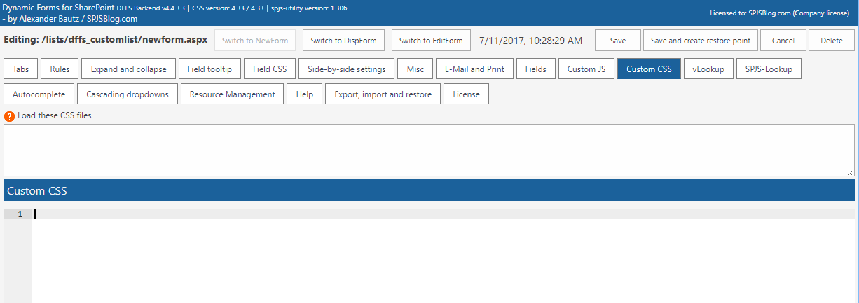
Use this text area to add custom CSS styles to the form. Use the developer tools in your favorite browser to inspect the form to identify the elements to change.
This field is for advanced users. If you have questions, use the forum.
Syntax highlighting
The syntax highlighting of the code in Custom JS and Custom CSS is done with the ACE code editor. You need DFFS v4.3.73 or above. If you use the CEWP installation method, you must include the ACE files from the folder “/SPJS/DFFS/ace” in the “DFFS_backend_CEWP.html” file.
vLookup [plugin]
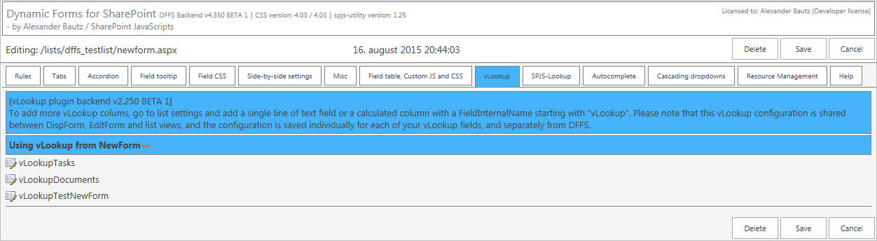
You find the vLookup product page and user manual here
Autocomplete [plugin]
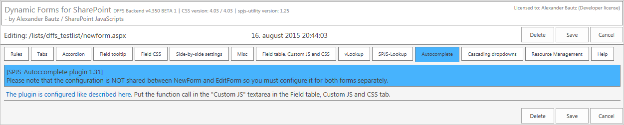
This plugin can be used to convert a single line of text field or a people picker into an autocomplete search box. Please note that SP 2013 already have autocomplete built into the people picker.
You find an article describing the setup linked from the tab in DFFS backend.
Cascading dropdowns [plugin]
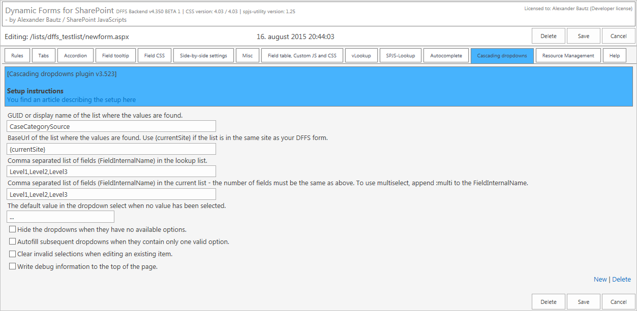
This plugin lets you convert multiple single line text fields into cascading dropdowns populated by a data source in another SharePoint list. You can have as many levels of dropdown as you like, and all you need to do is to add a custom list containing the data source.
You can have multiple instances of cascading dropdowns in one form; just click “New” in the bottom right corner.
You find a link to an article describing the setup in the top of the tab.
This is both a plugin to DFFS and a standalone solution.
If you are not using the JSLink version of DFFS, you must refer the file spjs-casc.js in the “DFFS_frontend_CEWP.html” and “DFFS_backend_CEWP.html” files.
When using the JSLink version, just tick the box beside the file name in the “Plugin section”.
Resource management [plugin]
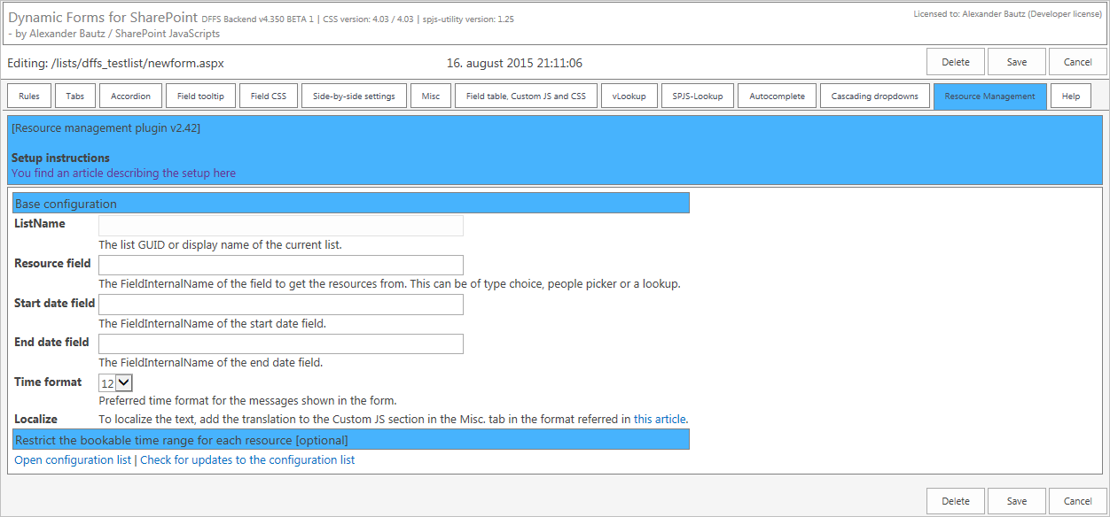
Use this plugin to prevent double booking of resources. The resources can be stored in for example a people picker field or a lookup column, and if the selected date and time is already booked, you cannot save the form.
You can use the basic functionality to prevent double booking only, or you can set bookable date and time ranges in the configuration list.
You find a link to an article describing the setup in the top of the tab
Help
Here you find links to use manual, forum and information about using the JSON format MUI format.
Export, import and restore
You can use the “Export settings” and “Import settings” to work with the “blob” directly, or you can use the “Browser restore points and deleted configurations” to see a list of all configurations for this list.
You can choose from all configurations saved for this list – both from NewForm, DispForm and EditForm.
When you use the button “Save and create restore point” to save a form, you create a restore point that can be restored here.
You can also restore a previously deleted config from this site, but please note that this only applies for items deleted after updating to v4.4.3.3 of DFFS.
License
Use this tab to generate the challenge code for site and site collection scoped licenses, and to save the license code.
Please note that the license is shared between all DFFS enabled forms in the site so you only need to do this step for one of your forms in the current site.
When you have obtained a valid license code you can add it to a file and have it automatically loaded in all forms using DFFS_Installer_v2 as shown here.
Direct backend access
If you want to be able to enter setup for your DFFS forms without going through the frontend, look at the code example in the file “DFFS_DirectToBackend.html”. Please note that this example is for SP2013 only.
Add this to a web part page in the same site, and use this to configure all the forms set up with DFFS.
DFFS Load time tracker
In v4.4.3.3 I have added a load time tracker to DFFS frontend. This will log to the console (hit F12 > Console) to see it. This will show the time taken to render tabs and process all rules on page load.
If you have trouble with a form being slow, look at this output to help identifying whats taking so long.
Tips and tricks
Change language on “You must specify a value for this required field” message
You can override the language for the “You must specify a value for this required field” message. Do it by adding this to the CEWP or to the Custom JS:
var dffsRequiredFieldValidation = "This is the new message for required fields!";
Refer an external script in Custom JS
Add the absolute or relative to the js-file (if the file is stored within the SharePoint site collection) to the textarea above Custom JS :
/SPJS/DFFS/custom/CustomScriptFile.js
Refer an external styleseet in Custom CSS
Add the absolute or relative to the css-file (if the file is stored within the SharePoint site collection) to the textarea above Custom CSS :
/SPJS/DFFS/custom/CustomStylesheetFile.css
DFFS_Email list with workflow
To be able to use the “Email the active tab” and sending E-Mails from DFFS rules you must set up a “Custom List” to send the messages.
In SP 2013 you can skip this step if you want to send all E-Mails immediately using the REST api. If you however want to delay E-Mails, you must set up this list with the workflow.
This list must be created in the same site as your DFFS enabled list, and must have a display name of “DFFS_Email” as this is hard-coded in the DFFS script.
Add list
If the list is not already set up, you will find a button to create it when you check the “Use custom list with workflow to send E-Mails” checkbox in the “E-Mail and Print” tab. You find this list in “Site Contents” with the name “DFFS_EMail”.
To ensure your DFFS_EMail list is up to date with the correct fields, toggle the checkbox “Use custom list with workflow to send E-Mails” off an on again in one of the forms in the site. This will trigger an update (if needed).
You must manually set up the workflow to do the actual sending of the E-Mails.
Set up the workflow
I have updated the workflow and added the step for the recurring email on September 10, 2017.
Enter SharePoint Designer to set up the Workflow.
Please note that even if you are on SharePoint 2013 (and want to use the Workflow to send the E-Mails) you must user “Platform type” SharePoint 2010. This is because the SP 2013 workflow will only send emails to valid members of the organization, and not external users or other external email addresses.
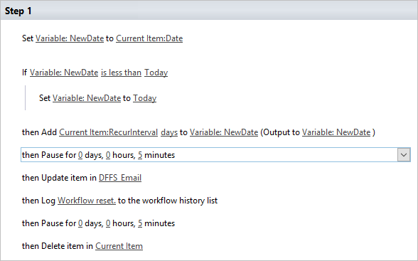
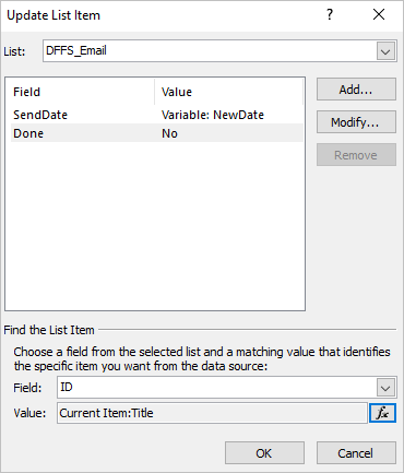
Primary workflow
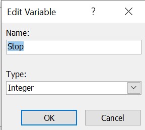
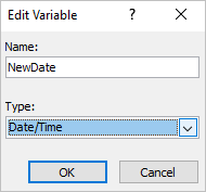
Here is a few screenshots of the setup for the primary DFFS_Email workflow. This is the final workflow, see additional images for details on the different steps. Images updated March 14, 2021 based on feedback from Amal Vellappillil to change the Stop variable type from boolean to integer to fix a bug in the workflow handling.
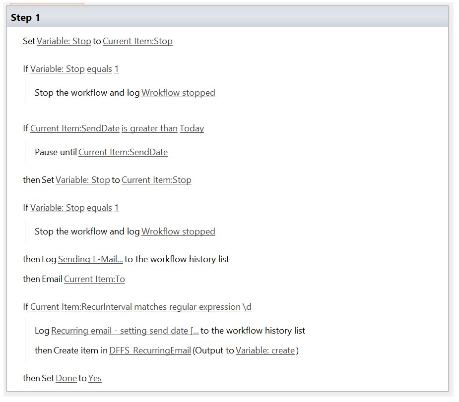
Due to a bug in the handling of boolean values in a workflow, I have used a variable to check if the “Stop” flag has been set on the paused workflow (by stopping the workflow in a DFFS rule).

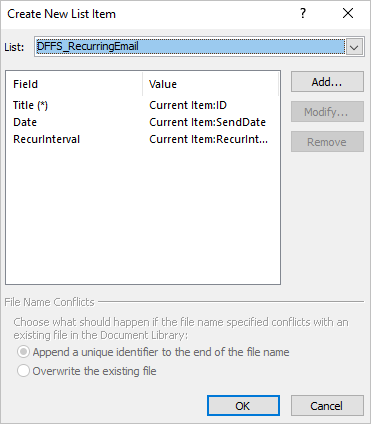
Recurring emails workflow
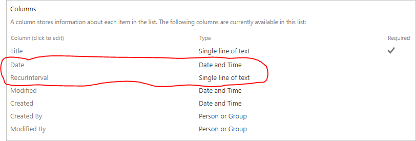
First you need to create a custom list named “DFFS_RecurringEmail”, and add two new fields.
One “Date and time” column named “Date”, and one “Single line of text” column named “RecurInterval”.
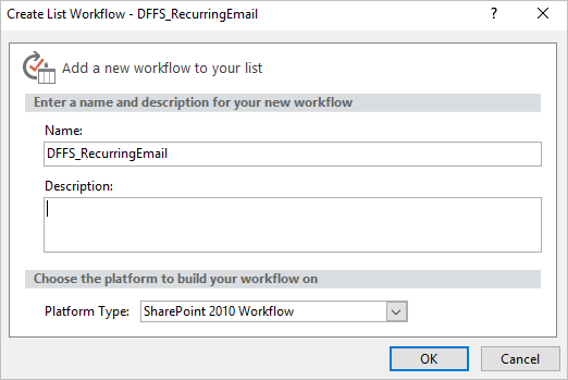
Then enter SharePoint Designer and crate a new workflow on this new list.
Delete list item when email has been sent
This step is optional.
If you want to clear the list after the email has been sent, you can add an extra “Delete item” action after the “Email” step. Please note that your users will need delete item rights, or you can set up a “impersonation step” to do the deletion with the workflow authors rights (SP 2010 and 2013 only).
MUI support
All text strings in DFFS can be formatted like this to support multiple languages:
{"1031":"German text","1044":"Norwegian text","default":"Fallback for all languages not explicitly added."}
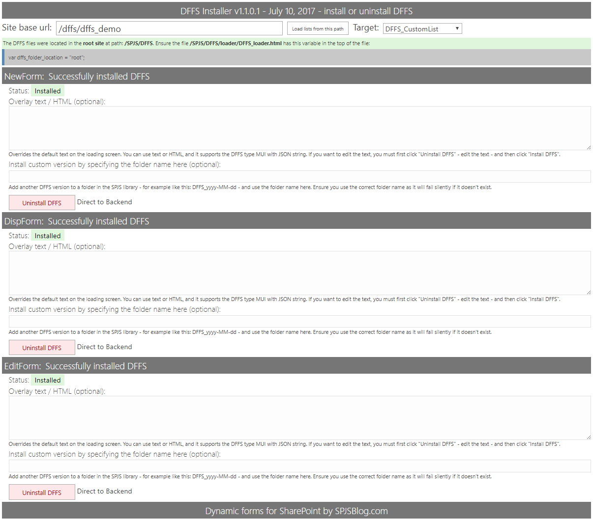
Change loading overlay text / image / HTML
DFFS Installer
You can override the loader text image / HTML for each form in the DFFS Installer page:
CEWP
When using the CEWP setup option you can edit the overlay code directly when inserting the “DFFS_frontend_overlay.html” file above the form web part.
If you have multiple identical lists in a site, you can share the configuration between all forms by adding this code snippet to a CEWP or Script editor web part above the form web part:
<script type="text/javascript">
var dffs_formIdOverride = "Shared_config_for_tasklists_NewForm";
</script>
The “Shared_config_for_tasklists_NewForm” is the unique identification for the stored configuration, and you must use the same id for all “NewForms” you want to share the configuration between.
Editing the configuration can be initiated from any one of the lists that share the configuration.
Using different DFFS configurations in the same form
There are a few methods for having different configurations for the same form in DFFS.
If you have a very complicated form with a lot of rules and complexity, you might want to split this up in different configurations. Here two examples of how you can do this.
Use different links to a NewForm
You can create separate configuration by using the URL key “FormConfig” like this:
// Variant A
https://example.sharepoint.com/DFFS/Lists/DFFSDemo/NewForm.aspx?FormConfig=VariantA
// Variant B
https://example.sharepoint.com/DFFS/Lists/DFFSDemo/NewForm.aspx?FormConfig=VariantB
Using this method you create completely different configurations that lets you keep the rule setup in DFFS more manageable when having different “inputs” to the same form.
Switching based on a status column in the list item
This example will create separate configurations for the form based on a column named CaseStatus. To start using this switch, all you have to do is to add these lines of code to a script editor (or HTML form web part or CEWP) above the form. Edit the page and put in this code in the top of your NewForm, DispForm or EditForm.
You must change the CaseStatus name to match your actual field name.
Please note that this only works when the CaseStatus column has a default value when you load the form and it will not switch form config when you change the field.
Here is an example:
When adding a new item in NewForm, the default value of the field is Draft, and the DFFS config for Draft will be loaded.
When you save your new item, you set the status to In progress either in a rule, or the user flips the status directly.
When you open the item in DispForm or EditForm, it will load the config for the current value in the status field – for example In Progress.
It will ONLY apply the correct DFFS config when the form is loaded, and will NOT change the DFFS config live when you change the status – the form must be saved and reopened to load the new DFFS config.
<script type="text/javascript">
// Override pageId to load different DFFS configurations for different statuses in the "CaseStatus" field.
var dffs_formTypeSwitch = "CaseStatus"; // Use FieldInternalName of target field
</script>
Change the FieldInternalName “CaseStatus” to match your field.
How does it work?
What this code does is to get the current value from the “CaseStatus” field, and appending it to the pageId it uses to query the DFFS configuration list for the correct configuration to load.
How to access the configuration for the different forms
To be able to configure the forms for the different Statuses, you can either enter DFFS backend from a form loaded with the correct status in the “CaseStatus” field, or you can edit the URL in DFFS backend directly to change for example “formType=Not started” to “formType=In progress” in the URL example below:
https://example.sharepoint.com/DFFS/Lists/DFFSDemo/EditForm.aspx?ID=90&backend=1&targetList={a5960b5a-8e29-4907-9b98-05a9bf94742a}&targetListBaseUrl=/DFFS&formId=/lists/dffsdemo/editform.aspx?formType=Not started&formType=3&saveLastGood=1
Please don’t get confused by the other “formType=3” key – the one you want to change at is in the key “formId”:
...&formId=/lists/dffsdemo/editform.aspx?formType=Not started
Load license code from file
This applies to DFFS Installer v2.
You can add the license code to a text file named DFFS_License.txt and add it to the folder /SPJS/DFFS/installer to automatically load the license code in the installer.
Include only the actual license code in this file, and ensure you don’t use any line feeds.
When you now enter the DFFS_Installer, the License code textarea in the Modify loader file tab is automatically filled withe the license code.
To update existing forms installed before you updated the license code you must hit the Update loader file button at the bottom of the Modify loader file tab.