- What does it do?
- The data source
- Configuration options
- Note to self
- GUID or display name of the list where the values are found
- BaseUrl of the list where the values are found
- Comma separated list of fields in the lookup list
- Comma separated list of fields in the current list
- Set field value
- The default value in the dropdown select when no value has been selected
- Optional filter
- Hide the dropdowns when they have no available options
- Autofill subsequent dropdowns when they contain only one valid option
- Clear invalid selections when editing an existing item
- Arrange multiselects side-by-side
- Change multichoiceDelimiter
- Show debug information
- Sorting of the options
- Invoke the function manually
- Change the button text with the :multi option
- Callback function when select is filled
Last updated: September 28, 2023
What does it do?
This solution lets you create a set of cascading dropdowns based on a query in another list. You can have as many levels of dropdown as you like.
The dropdowns can be single choice or multi choice. For single choice use a single line plain text field, and for multichoice use a multi line plain text field.
Please note that the values are stored as plain text and does not have a clickable link back to the source item as the built in lookup column in SharePoint has.
The selected values will also not update in the list items if you update the source list item.
The data source
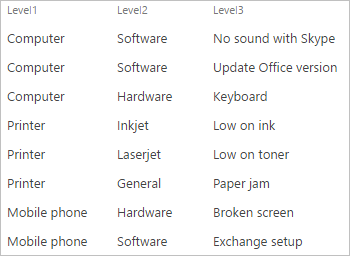
The datasource is a list with one separate column for each of the dropdowns in your cascading dropdown set.
The column in the dataset can be of one of these types:
- A single line of text column with one option in each field.
- A single choice lookup column.
- A multiline plain textarea with a pipe delimited list of options.
- A multichoice lookup column.
- A calculated column.
Example datasource with single line of text
Example datasource with pipe delimited options
Multilingual options
You can show the options in multiple languages by adding it in the datasource like this
{"1033":"English value","1031":"German value","default":"Default value"}
Please note that while the display value in the options adapt to the browser language, it’s the “default” value that will be saved to the database.
Configuration options
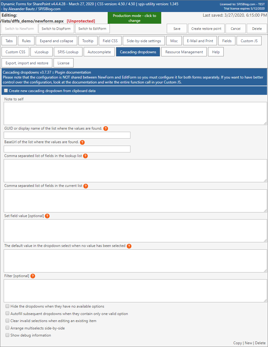
Note to self
This field is a not used in the configuration, and you can use it to keep notes to yourself.
GUID or display name of the list where the values are found
This is the list Display Name or GUID of the list that holds the values to populate the dropdowns.
BaseUrl of the list where the values are found
This is the relative or absolute URL of the site where the list is located. Use {currentSite} if the list is in the same site as your DFFS form.
Comma separated list of fields in the lookup list
Specify the fields in the data source list that you want to populate your cascading dropdowns with.
If you are using SP 2013 / 2016 / Online and want to pull in values from a lookup column or a people picker you must write the field name like this:
FieldInternalName/Title
Change Title to whatever property of the lookup or people picker you want to show – for example like this to get the email address from a people picker:
FieldInternalName/EMail
Fields starting with _
If have a field starting with _ you must prefix the field with OData_ like this (please note the double underscore):
OData__FieldInternalName
Comma separated list of fields in the current list
This is the fields in the current list item that you want to convert into the cascading dropdowns. To use multiselect, append :multi to the FieldInternalName.
Set field value
New in v3.7.37.
Use this for pulling additional field values from the cascading dropdown list when you have completed the cascading dropdown selection.
The format is like this:
[
    {
        "from": "Lookup_list_field",
        "to": "This_list_field",
        "parseFunction": ""
    }
]
You can add multiple fields in this array.
If your “from” field is a lookup or user field you can use FieldInternalName/Property – for example MyLookupField/Title.
If you want to modify the value before setting it in the form you can specify the name of your custom function in the parseFunction like this:
"parseFunction": "myParseFn"
This custom function must be added to your Custom JS in the current form in this format:
function myParseFn(val) {
    // do something with val here
    return val;
}
If you make another selection in the cascading dropdowns the setFields will be reapplied, and if you clear the selected value the setFields will also be cleared.
Please note that this feature will only work when using single choice cascading dropdonws.
The default value in the dropdown select when no value has been selected
The value to display in the dropdown select when no items has been selected. Supports MUI – see Help tab.
Optional filter
Use this to filter the datasource.
REST filter
You can specify a REST filter like this:
{"filterField":"Status","filterValue":"Active","operator":"eq"}
CAML query filter
Hide the dropdowns when they have no available options
Determines whether or not to hide dropdowns with no available options.
Autofill subsequent dropdowns when they contain only one valid option
If the next dropdown contains only one option it will be automatically selected.
Clear invalid selections when editing an existing item
If you open a list item in EditForm and the original selection no longer is a valid selection, you can decide whether to clear it or keep it.
Arrange multiselects side-by-side
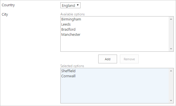
Use this setting to have the two select boxes side by side like the default SharePoint multi lookup columns.
Change multichoiceDelimiter
If you use the option to invoke the function manually you can override the default multichoice delimiter which is by default a semicolon followed by a linefeed. Change it to a value that is NOT found anywhere in your datasource to ensure it will not break strings unintentionally.
Show debug information
Used to troubleshoot the setup. While this is “true”, the list field where the input is stored will show below the cascading dropdowns select.
Sorting of the options
The default sort order of the items is alphabetically, but when using the pipe delimited options you control the sort order manually when you add the options in the textarea.
You can override the sort order by using a custom function for each of the fields in the cascading dropdown. Add this snippet to your Custom JS in the form:
spjs.casc.customSort.Level1 = function (a, b) {
var aa = a.text, bb = b.text;
if(aa.split(".")[0] < 10){
aa = "0"+ aa;
}
if(bb.split(".")[0] < 10){
bb = "0"+ bb;
}
if (aa < bb) {
return -1;
}
if (aa > bb) {
return 1;
}
return 0;
};
This sort function example sorts values that contains numbered options from 1-10. The default alphabetical sort order would sort like this: 1, 10, 2, 3 etc., but now it will show 1, 2, 3 and so on.
To sort another field in the same cascading dropdown you can either add another sort function for the other fields, or do it like this to apply the same sort order to Level2 as you used in Level1:
spjs.casc.customSort.Level2 = spjs.casc.customSort.Level1;
Please note that when using the pipe delimited values in the source list there will be no sorting of the options and they will show in the exact order they were written in the source list.
Invoke the function manually
If you need to control the function call in your custom code – for example if you want to use a different array of fields to populate the cascading dropdowns, you can call the function manually from the Custom JS like this:
spjs.casc.init(
 {
 "manualMode":true,
 "dataSource":"",
 "lookupList":"YourListName",
 "lookupListBaseUrl":"YourBaseUrl",
 "lookupListFields":["SourceField1","SourceField2"],
 "thisListFields":["ThisListField1","ThisListField2"],
 "setFields":[],
 "dropDownDefaultvalue":"Select...",
 "filter":"",
 "hideEmptyDropdowns":false,
 "autoselectSingleOption":true,
 "clearInvalidSelection":false,
 "addOwnValue":false,
 "addOwnValueMouseover":"",
 "cancelOwnValueMouseover":"",
 "sideBySide":true,
 "multichoiceDelimiter": ";" + String.fromCharCode(10), // this represents a semicolon and a linefeed
 "debug":false
 }
);
Please note that if you use this manual function call you shall not use the “Cascading dropdowns” tab in DFFS backend to configure it.
If you want to re-initiate the plugin after you have drawn it in the page you must “kill” it and re-initiate it like with the spjs.casc.init function shown above. The kill function is used like this:
spjs.casc.kill("FieldInternalName");
dataSource
The “dataSource” setting lets you use an existing dataset for the cascading dropdowns. This would be preferable when using multiple instances of spjs-casc with the same datasource in the same form to avoid running the same query multiple times.
Leave empty to use the default functionality with “lookupList” instead.
To use this option, you must use a function call to the Custom JS like this example to get the data:
var res = spjs.utility.queryItems({"listName":"CascInitialFilterSource", "query":"<Where><IsNotNull><FieldRef Name='Title' /></IsNotNull></Where>", "viewFields":["Title", "FieldValue", "LookupValue"]});
var dataSourceArray = res.items;
This query will give you a dataset in this format:
[
 {
 "Title":"Item #1",
 "Value":"Some value"
 },
 {
 "Title":"Item #2",
 "Value":"Another value"
 }
]
You can also use for example a REST query to get the data, or even specify the data object manually in the Custom JS textarea.
Use the variable “dataSourceArray” In the configuration like this:
spjs.casc.init({
 "manualMode":true,
 "dataSource":dataSourceArray,
...
...
When using the dataSource option you don’t have to specify the “lookupList” and “lookupListBaseUrl” parameters.
filter
The “filter” option should be passed as a proper object and not as a JSON string.
The option “manualMode” must be set to true to be able to trigger a change in the datasource if you call the function again with a new filter.
addOwnValue
This option lets the user type in their own value by canceling the dropdown select and show a text input. This option can only be used for single choice cascading dropdowns, and only when setting up a cascading dropdown in the Custom JS (the option is not available when using the “Cascading dropdown” tab in DFFS backend”).
This works by removing the dropdown select for the field you select, and for all descendants of this field. This action can be reverted to restore the dropdowns. Look at the snippet below for setup instructions:
spjs.casc.init({
 ...
 ...
 "addOwnValue":true,
 "addOwnValueMouseover":"Add your own value",
 "cancelOwnValueMouseover":"Reset",
 ...
 }
);
Add this to your DFFS Custom JS to specify the text used with the multichoice option:
spjs.casc.text = {
    "invalidData": "The selection \"{0}\" is not valid",
    "buttonTextAdd": "Add",
    "buttonTextRemove": "Remove",
    "unselectedOptions": "Available options",
    "selectedOptions": "Selected options"
};
Callback function when select is filled
New in v3.7.31
Add this function to your Custom JS to trigger code when a cascading dropdown is ready for selection. It is used when you need to use code to set a value for multiple levels of cascading dropdowns.
function spjs_casc_ready(id, readyFIN, index) {
    var config = spjs.casc.data[id];
    var filterValue = getFieldValue(config.thisListFields[(index - 1) > - 1 ? (index - 1) : index]);
    // Add your custom code here - like this example
    if (readyFIN === "Level2" && filterValue === "2. Printer") {
        setFieldValue("Level2", "Inkjet");
    }
    if (readyFIN === "Level3" && filterValue === "Inkjet") {
        setFieldValue("Level3", "Low on ink");
    }
}


