› Forums › SPJS Charts for SharePoint › SPJS Column Chart Colours
- This topic has 5 replies, 2 voices, and was last updated 7 years, 1 month ago by
Phil Grant.
-
AuthorPosts
-
-
February 17, 2017 at 10:44 #15686
Phil Grant
ParticipantHi Alexander,
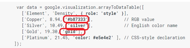
I’m now up and running with the Charts and I know I’ve already talked with you regarding the colour of columns in bar and column charts, you suggested some solutions but at the moment I don’t want to make any changes to the source data structure.I was wondering if anything can be done to pass colour to the chart using the google data structure.(see attachment)
My assumption is that your code creates this data table to send to the Google API, is there any way to insert a colour into this data, say, from the substitution code I use, i.e.
{
    "Not Yet Reviewed": "Not Yet Reviewed": "Colour",
    "Rejected": "Rejected": "Colour",
    "Agreed - Update Version List": "Agreed": "Colour",
    "Agreed - Add to next build phase": "Agreed": "Colour",
    "Pending - Further Work Required": "Pending": "Colour",
    "Agreed - Usage for specific vehicles only": "Agreed": "Colour",
    "Version list updated and published": "Agreed": "Colour",
    "Change Cancelled": "Cancelled": "Colour"
}
Just a thought.
Phil
-
This topic was modified 7 years, 2 months ago by
Attachments:
-
This topic was modified 7 years, 2 months ago by
-
February 21, 2017 at 21:30 #15774
Alexander Bautz
KeymasterHi,
I’m sorry, but I don’t have any method to set the color for individual bars in the same series of a chart.The example you give is actually three series and not one. If your add a column to group it by as first column – like the department column in the example I sent, you can use the “Split options in separate series” in combination with “colorByLabel”.
Alexander
-
February 21, 2017 at 21:49 #15776Participant
OK, I do struggle with the concept of creating charts sometimes, I just can’t get how a pie chart can take in one series “Status” and another “Count if ID” then generate elements “slices” and give them different colours after all my (probably simplistic) view is that the bar chart has the same input series as the pie chart and the bars are just elements of the graph so why can they not contain a colour property as per the pie chart.
Unfortunately I don’t have another series to add to do the same as the example with department.
I was hoping to achieve similar to “vary colors by point” in an excel pivot chart.
Oh well it still works well without the different colours, thanks for taking the time.
-
February 21, 2017 at 23:03 #15784Keymaster
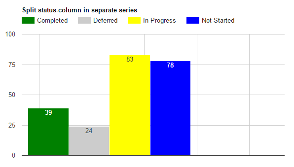
A bar chart and a pie chart is unfortunately not similar under the hood. If you look at the pie chart data in the example, it has multiple “rows” = series.
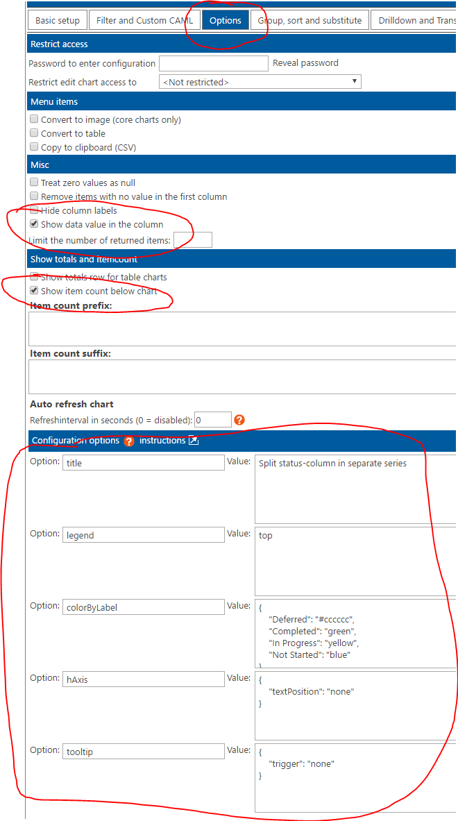
I have played a bit with the chart and you can actually set it up like this to split a choice column in multiple series, but you must hide the xAxis as it will not contains anything useful. See attached images.
Alexander
-
February 22, 2017 at 00:26 #15792Participant
OK, I’ll give that a try, if you don’t hide the x-axis do you get loads of stripey colours making up the columns instead of single colour columns because that’s what I get when I configure it like you, the only difference is I didn’t hide the x-axis.
I try it tomorrow and let you know if I’m succesful, thanks again for your patience.
Phil
-
February 22, 2017 at 10:21 #15796Participant
Alexander,
Thanks for sticking with me, I sorted it and found the root cause for my issues.The second series I was using was the ID, as a number and doing a count (not a sum), in your example you were using a title as a number and doing a sum so I changed my second series to a title and changed to a sum and it now works.
Cheers,
Phil
-
-
AuthorPosts


- You must be logged in to reply to this topic.