16.08.2011 I have released version 2.9.3. Read about it here
05.06.2011 I have released version 2.9.1. Read about it here
05.05.2011 I have released version 2.8.5. Read about it here
27.03.2011 I have released version 2.8 featuring different filtering methods. Read about it here
*** See bottom of article for change log on older versions ***
Since i posted the previous version of the solution that utilizes the Google Chart Tools / Interactive Charts (aka Visualization API), Google has updated their API and made the previous version more or less obsolete.
NOTE:
I have made a “bridge” between Google’s Visualization API and SharePoint. How the charts render or function it up to Google to decide – it is their “product”. Refer the various configuration options by following the link from the “Edit chart UI”.
Read Google’s terms of Use here.
Google’s Data Policy on this charts
All code and data are processed and rendered in the browser. No data is sent to any server.
This new release features these chart types:
Map | Motion Chart | Organizational Chart | Pie chart | Scatter Chart | Table
Other modifications made:
- All code in one file: “ChartUsingGoogleVisualizationAPI.js”
- In the CEWP: Refer the above file, jQuery (fixed external link) and the Google jsapi (fixed external link)
- Chart configuration list is automatically created if it is not already present
The solution is tested in IE8, Google Chrome 5.0.375.127 and Firefox 3.6.8.
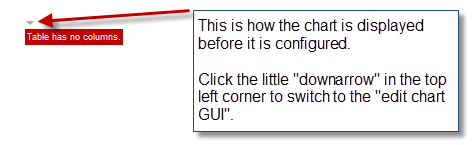
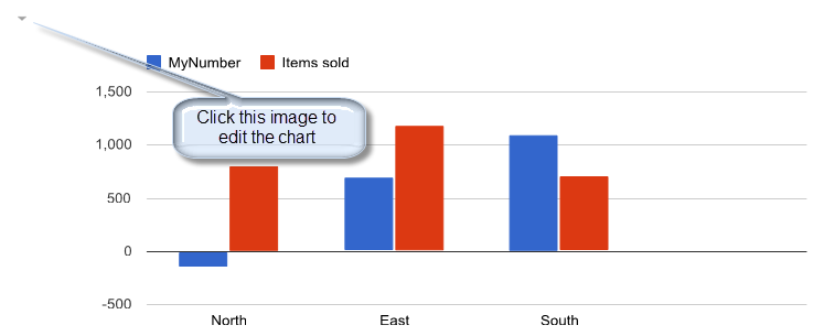
Some screenshots (from v2.0 – changes introduced in subsequent versions are not reflected her):
Not all chart types are presented.
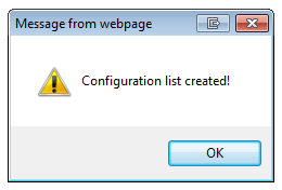
When first adding a chart CEWP to a site, the configuration list is created:

Press OK:
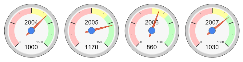
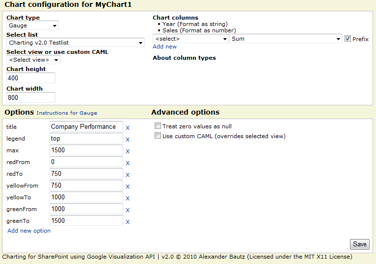
Gauge – a good KPI:
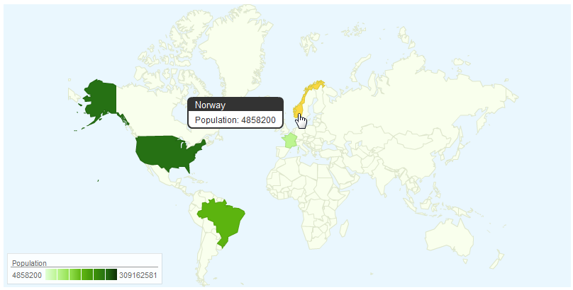
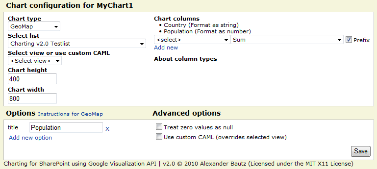
GeoMap:
Column chart – counting unique values per country:
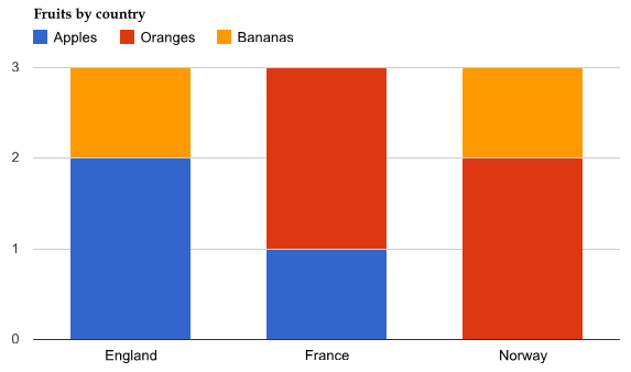
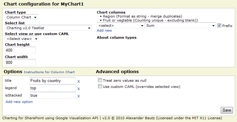
This chart type merges all “lines” where the country is the same, counting “fruits” in the choice column named “Fruit or vegetable”.
LineChart:


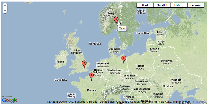
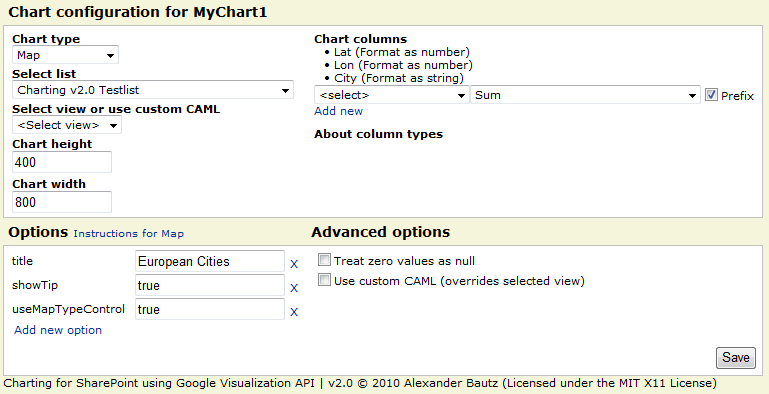
Map:
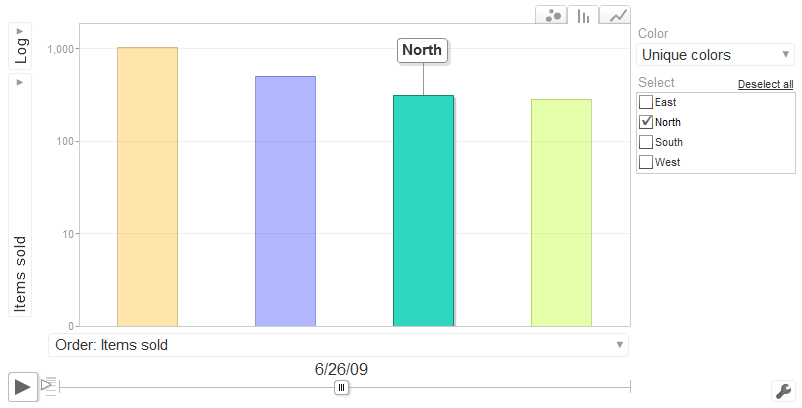
Motion Chart:
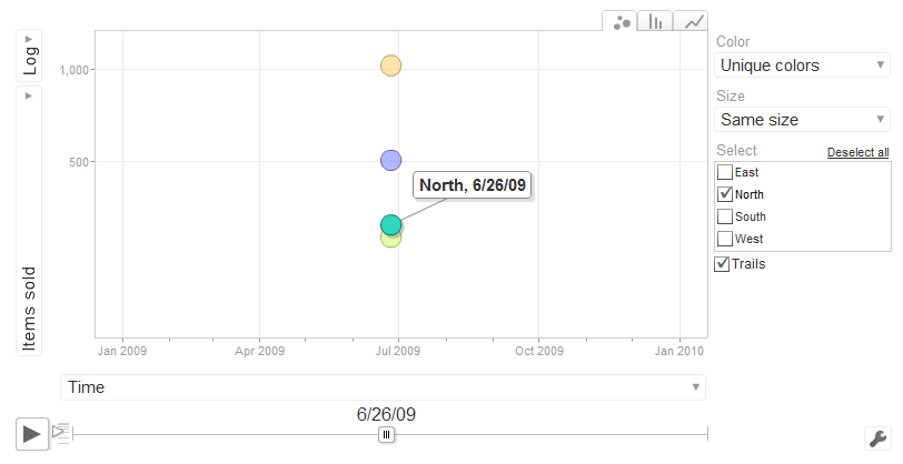
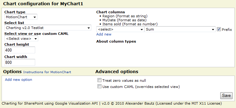
The “date” column can be a SharePoint data-column, or a “US formatted” string (still formatted as “Date in the UI”) in the format “mm/dd/yyyy”. Refer the “Instructions for MotionChart” link in the UI.
Organizational Chart:
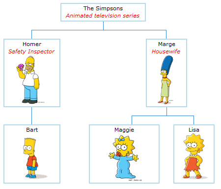

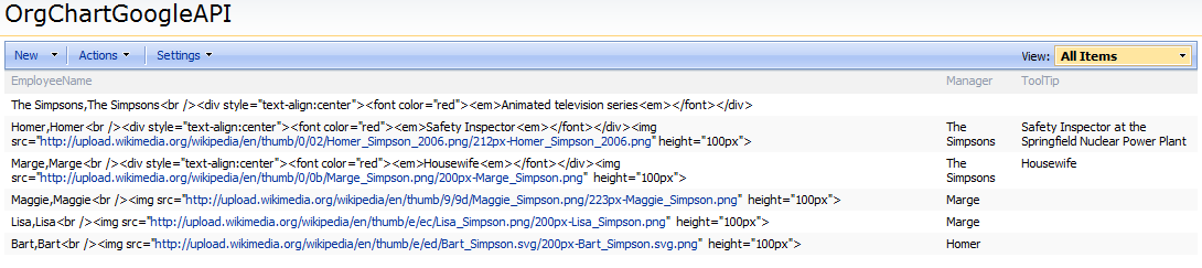
This is the data that makes up this chart. Note that it is built with various calculated columns – no need for it to render as HTML in the list – it is “raw data”.
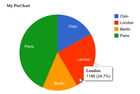
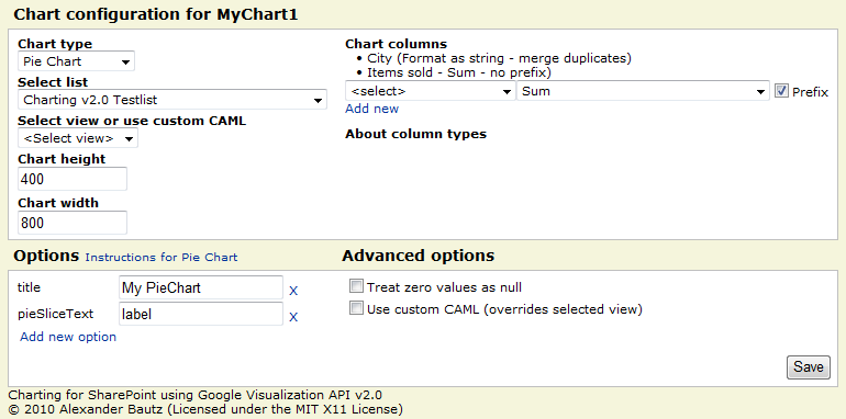
PieChart:
More examples – including custom CAML-queries will be added on request.
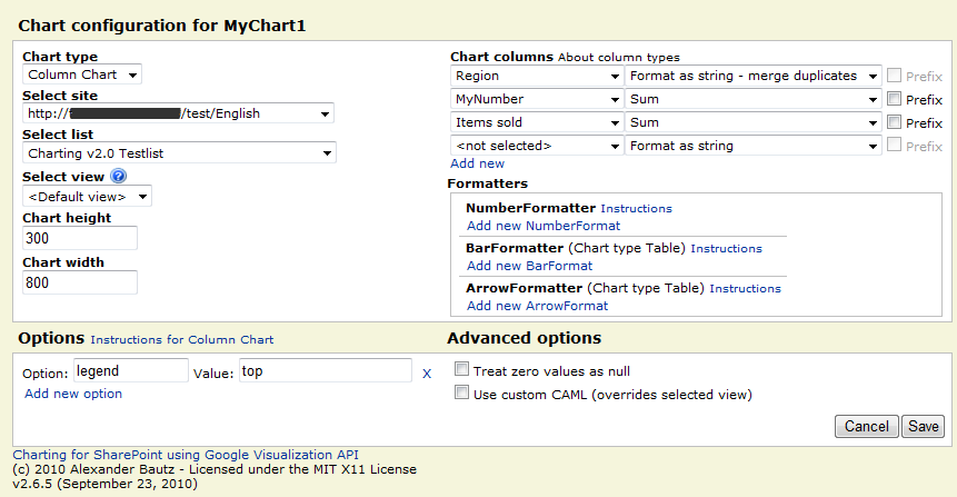
The new GUI from v2.6.5 (introduced in v2.5)
The Code:
This is the CEWP code:
<div id="MyChart1"></div>
<script type="text/javascript">
/*****************************************************
		Address all containers
*****************************************************/
// All charts must be represented by a container with a unique id. This container  must be present in the page
arrOfChartContainers = ["MyChart1"];
</script>
<script type="text/javascript" src="http://ajax.googleapis.com/ajax/libs/jquery/1.4.2/jquery.min.js"></script>
<script type="text/javascript" src="http://www.google.com/jsapi"></script>
<script type="text/javascript" src="/test/English/Javascript/ChartUsingGoogleVisualizationAPI.js"></script>
The placeholders can be inserted in other CEWP’s as long as they render before the chart is initiated (place them above the “Chart CEWP”).
It is essential that the scripts tags for “jsapi” and “ChartUsingGoogleVisualizationAPI.js” are placed below the script tag that defines the “arrOfChartContainers”.
The code for the file “ChartUsingGoogleVisualizationAPI.js”:
Download code from this location
This link can contain different “versions”:
- ChartUsingGoogleVisualizationAPI_vX.Y.Z.js – Uncompressed code
- ChartUsingGoogleVisualizationAPI_vX.Y.Z-min.js – Minified using YUI Compressor to reduce the file size
- ChartUsingGoogleVisualizationAPI_vX.Y.Z-packer.js – Compressed/obfuscated using Dean Edward’s Packer to further reduce the file size
You must update the script name in the CEWP to reflect the version number.
Note:
When new versions are released, they will be placed in a folder with the version number as label. Be sure to download the latest version.
If you are using a browser other than IE, right click the file and select “Save link as” or “Save linked content as…”.
Tip:
To make it convenient for end users to use this charting tool, create a few CEWP’s with your favorite setup (1 placeholder, 4 placeholders in a table form and so on). Export the CEWP and upload it to your web part gallery (in the root of the site collection).
You can now add it as a regular webpart from the “web part selector” in edit page mode.
Enjoy!
Alexander
27.03.2011 : New features are described here
19.10.2010 v2.7 is released. You find it in the “download section” above This version is the final fix (i hope…) for the web selector problems for non Site Collection Administrators (SCA).
For SCA’s there are no changes, but for those not SCA, I have abandoned my attempt to auto populate a web selector and gone for a input field. The user must write the URL of the web to load the list collection from. The reason for this is the fact that the method “GetAllSubWebCollection” is not accessible to non SCA’s, and that the manual iteration trough all webs caused prompts for credentials as it hit webs the current user did not have access to.
You will still get a credential prompt if you try to load the list collection for a web you have no rights to, but you will not get stuck in a “endless” loop of credential prompts.
New features:
In this version i have added the option to restrict edit access for a individual chart to a specific SharePoint user group. You find this setting in the Advanced option area in the “Edit Chart GUI”:
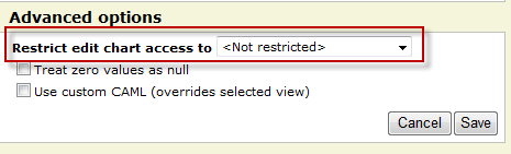
This is no “real” security setting as it only skips the rendering of the “edit chart button” and does not restrict the edit rights to the chart configuration list. If you want a true security setting you must change the permissions for each “chart” in the configuration list, or the permission for the configuration list itself.
v2.7 requires you to add one column of type “Single line of text” to the chart configuration list. The name of the field must be exactly “EditAccessGroupID” (without the quotes). Optionally you can delete the configuration list and have the script recreate it. The latter will result in you loosing all your existing chart configurations.
05.10.2010 v2.6.5 unintentionally made it impossible for other than site collection administrators to select web. This update (v2.6.6) fixes this issue. For uses that are not site collection administrators, the loading of the web selector may take a few seconds extra.
The check for edit page rights has been removed due to feedback from users that had problems editing charts. To restrict editing of the charts, manage user right for the configuration list – all users must have at least read access!
28.09.2010 Still some issues with the web selector as the v2.6.5 unintentionally made it impossible for other than site collection administrators to select web. I’m working on an updated version that will fix this. In the meantime, use v2.6.4 if you are not on a managed path…
23.09.2010 A new release (v2.6.5) has been added to the download section. This intends to fix the empty web selector for users with site collection on a managed path.
22.09.2010 There are some unresolved issues with the current release. You can follow the progress in the comment section below.
19.09.2010 A new version (2.6.1) is added to the “download section” – see bottom of article. It features enhanced functionality for selecting web. It now let you pick freely from all sites within the site collection (siblings, parent sites and subsites). This version may contain bugs, so please let me know if you find any.
14.09.2010 Small update to the code to fix the “Initial state” in motion charts, as well as some minor bug fixes. I have moved the files to my home server for you to download. This provides a better solution then manually highlighting and saving 2000+ lines of code. Please note that the file now come in three different “versions”. Read more in the “download section” below.
09.09.2010 Small update to the description regarding update from v2.0 to v2.5. I forgot to mention another field required to be added to the Chart configuration list: ListBaseUrl. This in addition to the already mentioned “ChartFormatters”. I have also removed an alert that was left in the code (line 40).
Christophe notified me of a problem with the 2010 compatibility in sub-site “homepage” – which is a wiki page. The CEWP HTML handling in SP2010 is a bit “different” than in SP2007. When editing the HTML source code, it actually pulls the contents generated by the script into the edit dialog and does not use the content that was originally saved to the CEWP… This is a bit of a headache!. A workaround for the wiki-pages is to use the “Content Link” property for the CEWP and link to a .txt file with the CEWP code placed in a document library (alongside the other scripts).
06.09.2010 Updated the script “ChartUsingGoogleVisualizationAPI.js” and the CEWP code. The version number is notched up to 2.5 and the changes are:
- Added the ability to chart data from all ascending parent sites and all first level subwebs of current site
- Added a few formatter options in the UI – refer the linked resources for instructions (thanks to Paulo for the tip).
- Added new “action” for formatting as % (value*100).
- The solution is now SharePoint 2010 compatible
- Enhanced the UI for editing charts – all options and columns are now directly editable.
- No more need to specify the “userListGuid” and the “userListBaseUrl” in the CEWP code.
- The naming of the charts in the Chart Configuration list is enhanced – it now prefixes the chartId with “location.pathname” to prevent overwriting an existing chart when reusing the CEWP code in another page (thanks to Christophe for the tip).
- Edit chart is now done in the standard “Browse mode” and not in “EditPage mode”. The edit button is found in the top left corner of the chart. The button is only visible for users with “Edit page rights” and does not show on printouts.
- And more…
Note: This update introduces two new columns in the configuration list (GoogleVisualization_InteractiveChartsConfig). To reuse the existing Chart configuration list you must add one field of type “Multiple lines of text (Plain text) named “ChartFormatters” and one field of type “Single line of text” named “ListBaseUrl”. Optionally you can delete the Configuration list and have this solution automatically recreate it for you.
Please note that the CEWP code has changed alongside the code for the file “ChartUsingGoogleVisualizationAPI.js”.
Note about existing charts:
All your existing charts will need to be updated with the new “page id” in the chart configuration list (GoogleVisualization_InteractiveChartsConfig). Look at the new configuration item that is automatically added – copy it’s name and update your existing chart configuration – while deleting the newly added (empty) chart configuration.
27.08.2010 Small update to the file “ChartUsingGoogleVisualizationAPI.js” to fix a formatting issue when using object literal notation in the chart options.
Wow! Thanks Alex, another masterpiece to spice up sharepoint.
Chris
Thanks ALex,
but the legend stuff does not work, no text at the coloured little boxes when i use piechart? Maybe I’m too stupid, but i get it working with your old version.
Any ideas?
Kind regards,
Andreas
Hi,
See new PieChart images in the article. Refer the UI-screenshot.
Does this answer your question?
Alexander
Hi,
yep, I got it running. I think I have to play a little around a bit more.
Thanks for the quick reply!
Good job!
Best regards,
Andreas
Alexander,
I’m not sure why but I have struggled to get both the previous version and this new version working.
When I add the CEWP code list above to a web part page (with the ‘ChartUsingGoogleVisualizationAPI_v2.0.js’ uploaded and linked), nothing happens. I can verify my script src is correct as I can throw an alert and it says function.
I don’t get any pop up saying the configuration list is missing or anything.
So other than just uploading the new visualization script and linking to it in the CEWB code, and placing that code in a CEWB on a page what else do I need to do?
This solution must load files from Google – the visualization packages and the jsapi.
You have Internet access from the client?
Other than that – it is hard to tell. Do you get some other of my solutions to function?
Alexander
I figured it out.
Using Google Chrome as my primary browser, even though you click “view source” on your code examples above to copy, the code is still encoded as HTML with tags and !
I should have picked up on that, my fault. So I re-copied the scripts and when added to my page I now get the pop up to create the configuration list (yay), so I should be good to go.
Maybe the fault lies w/ Chrome, WordPress, or the syntax plugin who knows.
Thanks again for your hard work and for sharing this stuff with the community!
Should have seen that coming. Mean to say with [span] and [a href] tags!
Alexander,
I really appreciate your work on this. I have been struggling to get a Google radar chart to read data from a SharePoint List. Is there any chance that this chart type could be added to the Google package array?
Hi,
Sorry, but this solution is utilizing the Google Chart Tools / Interactive Charts (aka Visualization API), and the Radar chart is part of the Google Chart Tools / Image Charts (aka Chart API)
Alexander
Alexander,
This is really great – I just have one question: I’ve downloaded all of the files, uploaded them to my SharePoint and reference them in the code and the charts are populating – but why do I still get a “do you want to view only the webpage content that was delivered securely?” error every time I refresh? I’m trying to use this at work on a secure network.
Thanks,
Kristen
Hi,
I’m not sure if this works, but try replacing the script “src” protocol from http to https.
Alexander
The script “src” protocol is already https, since all of the code is uploaded to my secure SharePoint (so all of the links are https). Is that what you mean? Any other ideas?
Hi,
Have you changed these in the CEWP code?
I’m actually not sure if this works, but it’s worth a try.
Alexander
Yes, they’ve been changed in the CEWP code. Is it happening because the “ChartUsingGoogleVisualizationAPI” references http links?
Kristen, this is happening because of the mixed content (http with https).
Fortunately Google have included support for HTTPS, so all you have to do is put the little “s” after the “http” in Google’s scripts refferences:
“https://ajax.googlea(…)uery.min.js”
“https://www.google.com/jsapi”
Thanks Paulo – does this work the same way with the microsoft links (e.g. http://schemas.microsoft.com/sharepoint/soap/UpdateListItems)? or should those not need https? I’ve tried a combination – changing all of the “http” to “https”, but when I change the microsoft ones, it doesn’t work. Sorry, pretty new at this. All of my google links currently have the https.
Nevermind, I got it to work. Thank you for the help.
Please describe what you had to do – for others with the same issue.
Alexander
I followed Paulo’s instructions. Previously I missed one of the google links which is further down in the ChartUsingGoogleVisualizationAPI code under the “Chart config options link” section.
Is there a trick to getting multiple text styles for a single options, as Google suggests, i.e. for hAxis.textStyle – {color: ‘black’, fontName: , fontSize: }
Whenever I try this format it only takes the first style, being color.
Hi,
I believe this should be fixed.
It had to do with the “quotes” being doubled up when constructing the object from the chart options.
Please let me know if this update fixed the issue.
Alexander
I updated to the new .js file and uploaded it to my script library, but when I enter the following I still only get color to change:
hAxis.textStyle: {color: “#494949”, fontSize: “18”}
You have to strip off the whitespace in the code like this: {color:”#494949″,fontSize:”18″}
Alexander
Worked! Thanks!
What are the new color codes for this updated API? When I use the previous HTML colors they all say this is not a valid color string.
Refer the Configuration Options for each chart by following the link from within the “Edit page UI”.
Post the code you are trying to use.
Alexander
One other issue, I can’t get multiple charts to show up.
I have three CEWP’s:
CEWP #1: only has
CEWP #2: only has
CEWP#3 (placed below #1 & #2 on the page): only has the code and next to arrOfChartContainers=[‘MyChart1′,’MyChart2’];
I can only get Chart 1 to display – any idea what I’m doing wrong?
CEWP #1 & #2 only have the placeholders.
Do you get any errors? – like The container with id MyChart1, is not defined!
Or just nothing?
Alexander
thanks for this great work, it’s very cool and so far I have had no set up issues whatsoever 🙂
But I do need some basic help! – I’m facing some trouble setting up my data. I have a SharePoint List with fields
1. Status (drop down options: New, In Progress, Closed)
2. Priority (drop down options: Low, Medium, High)
How do I go about creating a simple Guage chart which gives me the count for each of the above fields by Month (trying to use the internal SP filed Created as my date).
Do I need to create SP views for the type of charts I want to set up my data before I use the Google Visualization?
Rob,
I’m not sure if you can do this with the available chart options, but creating a calculated column for your list that just grabs the last 4 digits of the ‘created’ column (year) should work. Would work for month as well.
Also meant to add in the calculation you could say ‘if 02 then february’ etc (don’t know the exact formula) that your chart would report the months correctly.
Hi,
I’m not sure you will get a clean look by using Gauge chart… With your requirements you will get 12 month x 3 statuses = 36 gauges…
I think it is better to go for another type of chart.
Alexander
Hi, i am using the Visualization API for interactive Line Chart.
I am having trouble setting the vertical axis number of labels.
There is a configuration for the horizontal axis (hAxis.showTextEvery)
but not for the vertical.
Anyone can help?
I did a PrintScreen: http://www.flickr.com/photos/49033417@N00/4942583782/
Best regards.
Hi, There are no more configuration options available than the ones described at Google’s site: http://code.google.com/intl/en/apis/visualization/documentation/gallery/linechart.html
If you do not find it there, it’s not possible…
Alexander
Alexander,
Previously, I had 7 charts displayed on one page. It was working find with the v1.0 Visualization API, and now it’s working with the v2.0.1 the Visualization API 🙂
I have only one problem. Even though I followed your examples above, my titles are displayed using what looks like very small italic or cursive text… My legend displays correctly, but I can’t seem to get my titles to appear using the same default size and font as the legend. Any suggestions?
BTW, I did try specifying a font, size and color, but all I succeeded in doing was in creating error messages 🙂
Thanks,
Dale
Hi,
This version is “sensitive” to whitespace in the object literal. I will incorporate a “trim” action in the next release. Please post your chart options here and i will take a look.
Alexander
Alex,
Currently:
title = Connections by Method
is3D = true
Connection Method (Format as string – merge duplicates)
Connection Method – Count – no prefix)
Thanks,
Dale
Hi, I need the configuration options as well – you do specify the chart title font?
Alexander
This happens regardless of chart type… line chart, column chart and pie chart.
Alex,
At the moment, I’m not attempting to define the font, font size or the color. If possible, I’d like to use the same default values as the ledgend is using.
Dale
Hi, I did a test and it looks like IE is the sinner:
This is the formatting of the vAxis.title, and it is does NOT look like Arial…
Check the graph in Firefox or Chrome to see it render with the correct font formatting.
To overcome this, specify another font.
Alexander
Alex,
Was this what you used for “titleTextStyle”?
Yes, I am using IE8. Will try with a different browser to see if that makes a difference.
Thanks,
Dale
Yes, hAxis.titleTextStyle
Alexander
Alex,
You were right 🙂
IE8 displays cursive text for the chart titles, while FireFox4 doesn’t.
BTW, I tried adding parameters to change the title text, but it appeared to have no affect for visitors using IE8. I tried changing the font to something other than the default; I even tried changing the font twice within the same chart. Nothing I did appeared to have any affect.
Since 98% of my visitors will be using some version of IE, can you recommend a work around?
Thanks,
DF
BTW, I did try changing the font.
For example, I entered:
hAxis.titleTextStyle = {color:”black”,fontName:”Courier New”,fontSize:”13px”}
But in IE8 there was no change.
Hi,
Check the quotes. I can successfully change the font name, color and size (not the italic style though).
Alexander
Alex,
I can set fontSize = 16, and that changes the size of my title, but it also affects the size of my legend text. in my case, the legend text becomes so large, portions of the legend are missing, while the title text size is larger, but still barely readable.
I tried a number of different hAxis.titleTextStyle variations, but cannot seem to change anything about the way the titles are displayed. I can’t, for example as you have done, even affect the text size.
hAxis.titleTextStyle = {color:’black’,fontName:Arial,fontSize:16}
What am I doing wrong?
Thanks!
DF
Hi,
The title style is set using the option titleTextStyle and the parameter {color:”red”,fontName:”Arial”,fontSize:25px}
Alexander
Alex,
Thanks! I have successfully changed the size of my title text 🙂 The only thing that remains is to display normal text rather than italic text. (Darn IE!)
Thanks!
Nice update, Alexander! Thank you.
Alex,
With regards to the “Map” chart type I have 2 questions.
First, I’m using the same charting options as you have defined above, however, my chart is blank. For example, there is no map shown in the background (currently my map is displayed as a large blue rectangle) and there are not push pins. I know why there are no push pins (I have not entered any lat/long), but have no idea why there’s no map displayed for my background. Do you have any ideas?
Second, my current SP list contains a list of names and locations, etc… The location names are listed as city, state names… Given only the city and state name (i.e. Dallas, TX), is it possible to create calculated columns that will calculate the required latitude and longitude values?
Thanks,
DF
Alex,
Please disregard…
After some time had passed, I noticed my google map, complete with background and push pins where displayed!
For location, city, state was sufficient to generate push pins, however the push pins are incorrectly placed. When I zoom in, I see providing City, State is only sufficient to place the push pin in the city’s center. that’s not good enough for my application, so I’ll need to add the street address to my list. If you know a way to calculate the required latitude and longitude values based on a street address, city, state (rather than having to determine what the correct values are then hand enter /hard code them, I’d be interested in seeing how it’s done 🙂 ).
The only other thing left for me to do now is calculate a head count for each city. in my previous attempts when I added name/count/no prefix, I saw the error message “Error: You cannot include “mergeScaleType” and “fullScaleType” columns in the same chart.”. Any suggestion with the regards to a work around? I want to add one push pin per location and display the headcount for that location…
Thanks!
DF
Alex,
Not sure why, but after encountering the “Error: You cannot include “mergeScaleType” and “fullScaleType” columns in the same chart.” error countless times, I tried displaying the same data using other chart types.
I think it was after I displayed the data using a table, that I was able to display the data as a Google Map without this error message appearing…
Is that possible?
Thanks!
Hi,
The “You cannot include “mergeScaleType” and “fullScaleType” columns in the same chart.” error tells you that you cannot use “Sum”, “Count” or “Average” while using for example “String” or “Number”.
In the Map chart data you can provide street address to set the “Pins”, look here and test it: http://digitalinspiration.com/community/location.html
Alexander
Is there a trick to getting custom colors for a pie chart?
According to Google they want you to use this formula for ‘colors’:
colors:[‘red’,’#004411′]
When I use this formula, the colors don’t change.
Nevermind, I got it working. I just can’t get multiple colors to work for the column chart.
Hi,
I have no problem using this same approach on a column chart.
How is your setup (string column and number columns)?
Alexander
Hi Alex,
Browsing GoogleCode I just had an idea.
Wouldnt it be more painless to load all list/view data in the DataTable (GoogleVizApi) structure via XML? Im saying this because Sharepoint has a native support for XML files, each list/view have a mirror XML file.
So if we could grab this simple XML file and put it in DataTable and later perform any aditional needed manipulation via DataTable Methods or Formatters that would do most of the job, with less code. Off course there are drawbacks to this method such as CAML support but this could easly be substituted by the QueryMethod.
Let me know what you think about it.
Best regards,
Hi,
I’m not so familiar with pulling the XML from a list view (i know of the URL Protocol method using owssvr.dll but i have not used it).
The disadvantage is as you say custom CAML and it would require both methods in parallel.
I’m no expert in the Google DataTable API, and it may be other methods to populate them in an easier way, but for now i think i will still be using the webservice query trough lists.asmx.
Please let me know if you have additional input.
One note though – i looked at the URL Protocol method for SP2010 and it looked as if it has some limitations (maybe not for XML, but i haven’t looked at it in detail)
Thank you for the input anyway, and i may investigate this method in future releases.
Your input on numberformatters is incorporated in my next release – scheduled for the beginning of next week.
Regards
Alexander
Hi Alexander,
I am using stacked column chart. Everything works good.
I want to manipulate legend values. My chart Columns are as follows:
a) Data_Month (Format as string – merge duplicates)
b) Function Area (Counting unique – including blank)
Legend values are as follows: BI,CE,ISC,ERP,MFG that is nothing but Chart Column (b) unique values. Instead of this I want to display legend values as BI(Business Intelligence), CE(Customer Excellence)… and so on. I cant edit the values in list so need to do it using JavaScript only. I tried a lot but could not figure out that where you are passing the legend values.
Can you please tell me that where do I need to manipulate the legend values?
Thank You,
Nitin Gupta
Hi,
In this setup the legend values is given from the values in the column “Function Area”.
There is no interface to manipulate this in a generic way in the script, but try making a calculated column with a formula like this
and use it in stead of “Function Area”
Alexander
Hi all,
A new version (2.5) is released. Please read trough the article as the code for both the CEWP and the file “ChartUsingGoogleVisualizationAPI.js” has changed.
All existing charts need to be manually updated to add it’s new ID to the chart configuration list – see article for instruction.
Alexander
Alexander,
I attempted to make the shift from using v2.0 to using v2.5, but had no joy 🙁
At first, I created a CEWP like so to hold my 7~ charts:
Then I created a 2nd CEWP and placed your new CEWP code in it. I modified the code to allow for my paths, and my 7 active charts. I made sure this code was placed on the page, physically located under the CEWP described above:
/*****************************************************
Address all containers
*****************************************************/
// All charts must be represented by a container with a unique id. This container must be present in the page
arrOfChartContainers = [“MyChart1″,”MyChart2″,”MyChart3″,”MyChart4″,”MyChart5″,”MyChart6″,”MyChart7”];
Then, I copied the new v2.5 ChartUsingGoogleVisualizationAPI.js file to my js folder (on my SP site).
Finally, a new chart configuration list was not automatically created, so I manually created a new list using your original v1.0 code as my example. I was careful to include a new column for ChartFormatters. You said it wasn’t necessary to include the ViewGuid, or the ListGuid info, but I created the columns anyway:
•Title (the standard title field already in the list)
•ChartConfig (Multiple lines of plain text)
•LabelCol (Single line of text)
•NumCols (Multiple lines of plain text)
•UseCustomCAML (Yes/No check box)
•CustomQuery (Multiple lines of plain text)
•ViewGuid (Single line of text)
•ListGuid (Single line of text)
•ChartHeight (Single line of text)
•ChartWidth (Single line of text)
•ChartType (Single line of text)
•GetFilterFromProfile (Yes/No check box)
•UserProfileProperty (Single line of text)
•RegexProfileProperty (Single line of text)
•ChartFormatters (Multiple lines of plain text)
However, I’m not seeing any control panels for editing any of my chart configurations…
BTW, the list I pull my data from is located on a different page than my charts… The list is on a data entry page and the charts are displayed on a Dashboard page. If my data is on a different page, and the columns ViewGuid and ListGuid are no longer required, how does the chart know where to pull my data from? I didn’t create a column called “page id”. Maybe I should?
Please tell me, did I misunderstand something in the setup, or forget a step as I set things up anew?
Thanks!
DF
Alex,
Not sure why, but some of the html that should have been listed above isn’t… I guess it was stripped off after I clicked the “Submit Comment” button…
DF
I’m beginning to think it’s not necessary to create the Configuration list like we did with v1.0… I created a new list with charts (from scratch) and noticed v2.0 doesn’t populate the Configuration list. Instead, GoogleVisualization_InteractiveChartsConfig is created — I also noticed I can’t view the information stored inside this file 🙂
Read here: How to post code in comments
If you upgrade from v2.0 the chart configuration list is not created automatically – it already exist. It does however lack the one column as described in the article – “ChartFormatters”.
Note that the “edit chart” action no longer is accessed in “Edit page mode”.
Which file is it you cannot access?
Alexander
Alex,
Still haven’t gotten v2.5 working. I recreated a set of charts from scratch using the ChartUsingGoogleVisualizationAPI.js v2.0. When I did so, I followed the original ChartUsingGoogleVisualizationAPI.js v1.0 installation procedure.
Afterwards, I noticed my Configuration list was empty (even though I can successfully display 7 charts). So I guess the old Configuration list is no longer needed??? If the old Configuation list is not needed, where do I added the column “ChartFormatters”???
What I can see is the GoogleVisualization_InteractiveChartsConfig web part … After I placed a copy of the GoogleVisualization_InteractiveChartsConfig web part on my screen, I could see entries for each of my 7 charts, but when I clicked on any entry, I was unable to view the details of each charts config. (No biggie really, as I can configure the charts the normal way. I just liked having the ability to view/edit the config directly if needed).
Maybe a new v2.5 specific installation proceedure would be helpful 🙂
Thanks,
Dale
Hi, The thing is that there are no installation required. The chart config is automatically created and and all you need is to add the CEWP. Alexander
Alex,
Disregard… I have edit buttons and configuration controls now. Maybe within the hour I’ll have all 7 charts displayed using the v2.5 API 🙂
Thanks!
DF
Hmmm, still no joy…
I have the edit button, but after I input my chart settings and click “Save”, I encounter a “A column is missing in the Chart Configuration list” error.
I started with v2.0, then upgraded to v2.5 I already added a column for “ChartFormatters”… What other column could be missing?
Thanks!
I deleted the configuration list, allowed the v2.5 code to rebuild the list for me. I’m now able to add charts to my page 🙂
Hi,
I forgot about another field in the configuration list that was new in v2.5… See comment in the “Change log” in the top of the article.
Sorry for the inconvenience.
Alexander
Alexander,
With regards to a future version, do you think it’ll ever be possible to create combination charts?
For example, a single chart consisting of one column chart and one line graph?
Thanks,
DF
Hi,
That depend on Google. I’m not creating the Visualization API, but merely “bridging” it with SharePoint.
Alexander
Hi Alexander,
Is it possible to render stacked column chart based on 3 columns, where 3 columns are as follows:
1. Month (values are: Jan,Feb, Mar, Apr,May)
2. Function Area(Value are: BI,CE,ISC,MFG,ERP)
3. Capital (can be any number)
I want my chart to be stacked as follow:
For Jan month: sum of capital for each function area value(that is Jan column will be stacked into 5. Sum of capital for BI,Sum of capital for CE,Sum of capital for ISC,Sum of capital for MFG,Sum of capital for ERP.)
Same for Feb month: sum of capital for each function area value.
Same for Mar month: sum of capital for each function area value, and so on…
I tried a lot but could not render the chart. I am using v2.0 only.
If my explanation is not enough, shall I send a screen shot of my chart that I built in Excel?
Please help me.
Thanks You,
Nitin Gupta
Hi,
The charts doesn’t support more than one string column as horizontal axis. I don’t think this chart is possible to create before Google changes the API to support this – hopefully in a future release.
Alexander
Brilliant piece of work as usual – thanks.
I like the Motion Chart but I seem to be unable to set a “title” or an initial “state”. I notice the example in the post is also without a title – is this an issue ?
Cheers
John
Hi,
The Motion Chart supports there options and the Title is not one of them… To have a title, set it directly in the CEWP (above the chart placeholder <DIV>).
The “initial state” will be fixed in a new release (later this week).
Alexander
Hi Alexander,
I haven’t been able to place more than one linechart on a page. Is this a restriction of the API (haven’t found anything regarding this) or the script? The second line chart doesn’t render at all, IE 7 reports an error in line 152 which actually is a blank line, the error message is “Invalid column index -1. Should be an integer in the range [0-0].”
If you need more information let me know.
Chris
Hi,
I have no problem with this. Are you using the latest code?
Alexander
Currently using the code from Sept. 6th. Will change to the new version and try again.
Chris
Hi, I think I’ve found the problem now, I’m trying to use two line charts from one list/two views. Both views contain a Red/Amber/Green project status but for two different parties. The charts should share the same green status but should contain individual amber/red status. The sharing of the green status seems to be causing the problem, I’ve solved it now by creating another column with =RAGStatus&” “.
Now both charts are rendered they way I want to.
Chris
hello
Sorry for my bad English, but I’m french …
First a big congratulations and thank you for this script is great, everything is OK
I use the chart type “Line Chart” and I would just like to know if it is possible to display values at each point in the graph or on the last point and not just passing the mouse cursor
Thank you for your answers
Daniel
Hi Daniel,
Your English is perfect – keep in mind I’m Norwegian!
I cannot help you with your request as the charts are created using Google’s Visualization API, and it currently does not support this option.
I hope they will make this possible in future releases, and if they do, i will implement it in this solution.
Alexander
This tool is amazing – I made multiple variations and saved as web parts for use – single chart, 2×2, 3×3, etc.
Here are my very short list of “love to haves”!!
– ability to pull in cross-site list data (i.e. not just in the site, sub site tree, but across the same collection)
– ability to change the div name in the Edit Chart section, so as to not have to have client edit the source if they want to have a single chart on one page, a different on on another, etc.
In ANY case, this is a fabulous piece of work, and something that elevates our content and makes information far more accessible across the enterprise. GREAT JOB!!
Bill
Hi Bill,
I’m glad you like this solution.
Regarding your “love to have” list:
ability to pull in cross-site list data: This will be fixed – i must have been a slip in my logic…
The div name does not have to be changed unless you want to use the same CEWP in multiple places in the same page. The ChartID is concatenated using the “location.pathname” and the <div> ID.
I will release a updated version as soon as i have fixed the “web selector”.
Alexander
Hi Bill,
Look at the new release (2.6.1). This is intended to fix the “sibling” web site issue.
Alexander
Alexander,
Using API v2.6, my OrgChart look fine, but when I substitute API v2.6.1, the OrgChart is NG 🙁
All I did was drop the new js in place and point to v2.6.1 instead.
Any suggestions?
Thanks!
DF
Alex,
Sorry, I was running v2.5 before (not v2.6).
After the upgrade to v2.6.1, that when the OrgChart went haywire 🙂
Thanks Again,
DF
Hi,
Confirmed bug introduced in v2.5.4, will be fixed very soon.
Alexander
Fixed in v2.6.2 – please test it.
Alexander
Alex,
I have 2 pages full of graphs.
One the first, I have an OrgChart and a google map, both of these display properly. i.e. v2.6.2 resolved my OrgChart issue.
On the second page, I have a dashboard consisting of 8 pie, line, and column charts. v2.6.1 had no problem displaying these graphs, however, when I replaced v2.6.1 with v2.6.2, suddenly only the first 2 pie charts displayed. The remaining 6 charts (line, pie and column) do not display. There is a error message that says “Invalid row index -1. Should be in the range [0-2]
”
Message: Invalid row index -1. Should be in the range [0-2].
Line: 151
Char: 29
Code: 0
URI: http://www.google.com/uds/api/visualization/1.0/c453b4ccbdc9f6fe8d303f0d9aa0f57f/default,table,orgchart,motionchart+en_US,map,geomap,gauge,corechart.I.js
Thanks!
DF
Hi,
Please test v2.6.3 and see if that helps… I still have some small possible errors lurking from my “total makeover” in v2.5.4…
Alexander
Alex,
After installing v2.6.3, all maps display properly 🙂
Thanks!
Hi,
i added the scripts to my libary and created a CEWP with the code on an empty page.
After that the config list was automatically created.
So i added “Chart1” as div id and element of the array.
But after saving and refreshing an error occurs:
“The package “0”, is Not loaded.
Review the CEWP code and add the chart typ to the packages array.”
Thanks
Jan
Hi,
The “packages” are loaded from Google. Does your client have Internet access or is this a “confined” intranet?
The packages are loaded in line 1224 in the uncompressed code.
I need some more details to help.
Alexander
My client has internet access.
Which Information do you need?
Jan
Please send me a screenshot of the CEWP code to start with. You find my email here
Alexander
Hi,
It’s the first time i work with this solution.
I updated the api but nothing changes.
Maybe i have forgotten something essential.
First i added the scripts to my library and a CEWP with the code to an empty page.
After saving and refreshing the config list was created.
That’s all i did.
Do i have to add a second CEWP where the Chart is displayed or modifie the element in config list??
It’s a subsite but i use this URL in Newform, Editform and Dispform to create Tabs, too.
Thanks
Jan
I added the CEWP to another page and now i can edit a chart.
But i can’t select any chart columns.
I selected the site and list.
Do i have to create a new view with group by?
Jan
Is it possible to access a site collection.
can i define the site collection in ChartUsingGoogleVisualizationAPI.js?
At the moment i can access all sites and subsites.
But there is a stie collection i have to access.
root: site
Hey A,
I am having a similar issue “The package “0″, is Not loaded.
Review the CEWP code and add the chart type to the packages array.”
when editing the chart, I have no Subsites and cant access them. I use the arrow but can only navigate up, it does not show access to current site collection. I have internet access, internal and external. I have created a new page with nothing on it and same issue. I believe if I coould get the subsites to populate the dropdown it would work, but I’m lost. Any suggestions?
okay, so playing with this I went to the chart list and manually added the root url for the list. It still leaves the site dropdown blank but I was able to coinfigure the rest. So now I just need to figure out how to get the site dropdown to populate
Hi Larry,
Which version are you using?
Please give some more details – like is it root site or subsite? Which page are you trying to add the chart to? (webpart page default.aspx or other)
I have tried and cannot reproduce this behavior so i need feedback from you.
Alexander
I found the problem. I will fix it later tonight. Please stand by – no more details from you required.
Alexander
Look at v2.6.4. This should fix the “The package 0, is Not loaded”.
The error originates from the configuration list where all fields have a default value of 0.
To fix this issue for your existing configuration list you must edit all fields and get rid of the default value of 0, or delete the list and have it recreated.
I’m not sure whether this fixes the problem with navigating to subsites, but please give it a try and let me know if it does any difference.
Alexander
Larry and Jan:
Are your sites in a managed path? – this might have to do with the missing “site selector”.
I will investigate a bit, but appreciate feedback.
Alexander
My assumption was correct – managed path breaks the site selector. It will be fixed within 24 hours (approximately…).
Alexander
Hi Alexander,
error “The package 0, is Not loaded” is fixed.
Thanks.
Jan
Hi Alexander, Great work.
I’m trying to add options to a column chart. I can do things like Legend: none. I can’t seem to figure out how to set the Y axis title. I’ve tried…
vAxis: {title: ‘Hello’, titleTextStyle: {color: ‘#FF0000’}}
vAxis.title: Hello
vAxis.title: ‘Hello’
vAxistitle: Hello
vAxistitle: ‘Hello’
Can you provide some guidance?
Thanks,
Graydon
You find all options from the link in the “Edit chart GUI”. Look here for options for Column chart http://code.google.com/intl/en-EN/apis/visualization/documentation/gallery/columnchart.html#Configuration_Options
Alexander
A new release – v2.6.5 has been added to the download section. This intends to fix the empty web selector for users with site collection on a managed path.
Please give me feedback on any new errors, or if it fixes some of your existing problems.
Alexander
Hi again Alexander. Thank you for you last response.
I’m now migrating from V1.0 to V2.6.5. I deleted my original config list and allowed v2.6.5 to create a new one. After I update to the new CEWP code, I receive a “Table has co columns” error. Any idea what might be causing this?
Thanks again for the great tool,
Graydon
You must configure your chart and select a list and fields. This “error” is no error…
Alexander
The configuration window doesn’t open when I edit the page. I’m not getting to teh point where I can select a list and fields.
Here is the code from from my CEWP.
Thanks,
Graydon
I should have also included that I’m not getting the edit button in the top left corner of the chart.
Thanks,
Graydon
I commented out the if(hasEditPageRights) statement around the editChartBtn code in your script and now I can see the edit button and open the configuration window.
I have found a problem with the last version (v2.6.5) regarding the site selector.
The method i have used to populate the site selector is only accessible for site collection administrators…
I will have to revert back to the last version, i just have to fix the error regarding sites on a managed path first.
Sorry for the inconvenience.
Alexander
This is a wonderful solution and I really appreciate all of the work you’ve put into this.
On a side note…it appears that the download link is currently down.
Great work!
–Scott
Hi,
My server is currently down due to some troubles with an update from Microsoft (It’s a WHS).
I’m working to resolve this issue.
Alexander
Alexander,
In my case, I’m already logged into SharePoint…
If I change my code to use v2.6.6 (instead of v2.6.4) and then attempt to edit a chart, a popup appears asking me to input my user name and password again. No problem… I reauthenticate and press OK.
But then the popup reappears (as if my credentials are not valid). I can authenticate several times, but the popup continues to reappear.
However, if I select “Cancel” without inputting my credentials, I can access the chart configuration and edit parameters to my hearts content…
Any idea what’s going on, either with SharePoint, my credentials or with the api?
Thanks,
DF
Hi,
Can you confirm that you have only read access to some of the sites in the site collection?
If so, does the read access permission group have the “Browse Directories permission” right?
It seams the GetWebCollection webservice call needs this permisson…
Alexander
Alex,
I’m the site coordinator for a rather large site (72 subsites). All of the sites are part of the same site collection.
We’re checking now, but I should have full access to all of the sites/subsites I created 🙂
Can you enlighten with with regards to “Browse Directories” permissions?
The effect of adding Browse Directories to the Read level isn’t documented very well. Here’s a post from a guy who did some testing to try to figure it out:
http://www.novolocus.com/2008/07/03/browse-directories-and-webs-getwebcollection-strangeness/
It seems to have some unwanted effects, like breaking security trimming (that is, allowing people to see directories that they can’t open)…
Can you explain/enlighten/etc…???
Thanks!
DF
Hi,
I found the same article you did… I’m just looking for a lead on this problem and have no further info on the browse directory rights…
I have done a quick test using another user with read access and cannot reproduce this credential prompt.
If i give a user read access only to a subsite, the current site is listed correctly in the site selector – with its lists, but any subsites are not listed.
Any additional information is greatly appreciated!
Alexander
I had a similar experience to DF, and here are details.
On a site where I do NOT have Site Collection Administrator priviliges, I am prompted over and over to login. Hitting cancel allows me to get to the configuration.
From there, I can choose the site and any subsites to that one site, but I cannot choose “sister” level sites. I.E. I am on sites/et and I can choose sites/et/train, sites/et/instructior, etc; I cannot however choose sites/dist or any of its subsites.
I went to a site where I have Site Collection Administrator priviliges, and I am not prompted to login, but still cannot navigate to sister level sites.
I do not see the UP and DOWN arrows that were in previous version.
WSS3 MOSS2007
Hope the info helps – love this tool!! Thanks!
Hi,
See the comment above.
Regarding not seeing “sister sites”: This tool can only read from the sites in the current site collection. Does this sister sites reside in another collection?
Alexander
DF and Bill: Can you please test v2.6.7 as i have made one experimental change. It might be a wild goose chase though…
Alexander
Alex,
My experience with v2.6.7 is the same as with v2.6.6.
With v2.6.7 and v2.6.6, I’m repeatedly prompted for my credentials (like I’m in a endless loop)
But if I select “Cancel”, I can get right into the chart parameters editor.
Thanks!
DF
Could you please test v2.6.8 and see if that makes any difference?
Alexander
I tested with 2.6.8 and got the endless loop as well under these two conditions:
– placing 2.6.8 in a library on the same site
– placing 2.6.8 in a library on an anonymous access resource center site
Of course, hitting cancel takes you straight to the config web part.
Let me know if you need anything else tested!
Bill
Alex,
No difference (for me) between v2.6.7 and v2.6.8.
DF
Bill and DF:
Could you please test v2.6.9 and tell me which of the alerts that are followed by a login prompt. One test per alert is good enough – no need to complete the “loop” and login on all prompts…
Note: This affects only those that are NOT site collection administrators.
Alexander
Alex,
When I tested 2.6.9 I saw (5) instances of alert “1689 DEBUG ID 1”, followed by a since instance of “1708 DEBUG ID 2”.
Thanks,
DF
a single instance of “1708 DEBUG ID 2″…
And the login prompts – did they follow each and every alert?
Alexander
Alex,
I was prompted for my credentials first (before any alert messages were displayed).
If I clicked “OK”, I was prompted again for my credentials.
If I clicked cancel, that’s when I saw the 6 alert messages.
Thanks,
DF
Hi,
Can you please test the updated “debug-version” and e-mail me some screenshots of the alerts (you can obscure URL’s if that is necessary).
If you are not site collection administrator there are some “errors” that you are bound to get, but please collect the screenshots and i will look at them and see if i can make something useful out of it.
Alexander
I have captured several error message images – http://www.mysharepointers.com/SiteImages/Forms/AllItems.aspx
That was on a site that I do not have site collection rights, strictly am an owner of the site. Once error message 1 – 4 appear, I am able to navigate the parent site’s lists, and the sub-site’s lists.
I will test on a site where I have collection privileges and post any error messages in same location..
Retested with a site I have Site Collection privileges to, and generated error message 5 and 6, at the same link as earlier.
I am no longer prompted to login to edit the chart, and as long as I put in a valid list/column combo’s, no more pop up error messages.
Hope that helps!
bill
Alex,
If you can send me a private e-mail, I can forward the screen captures.
If not, the text of the error message I saw was:
================================
status:
401
responseText:
401 UNAUTHORIZED
webserviceUrl:
/xxxxx/xxxxxxx/xxxxxx/_vti_bin/Webs.asmx
soapBody:
================================
Thanks,
DF
Sorry, some of the error message was removed from my posting after I clicked the “Submit Comment” button 🙁
You find the email here
Bill,
Regarding the images:
1_UponExitEdit: As expected – the configuration list have not been created yet.
2_AfterConfigListCreatedMessage: As expected – the configuration list item have not been created yet.
3_AfterCancelLogonToEdit: This tells me that you are NOT site collection admin as non SCA cannot use the method “GetAllSubWebCollection”.
4_AfterCancelLogonToEditMessage2: As expected – this tells me that your site is on a managed path below /sites/
5_UponExitEdit: Not sure actually – but i don’t think it is important…
6_AfterConfigListCreatedMessage: same as img#2
The good news is that i think i have cracked it. I will post the updated code tonight.
Alexander
Hi,
I have found the cause of the error and will make a fix, but it wasn’t so easy as i thought… I hope to have the fix ready in the beginning of next week.
Alexander
Firstly, I just want to say that this solution is awesome! I am the administrator for several SharePoint sites and have implemented this solution with great success. I recently tried implementing this on a site for one of my clients and it does not seem to be working. The space saver for the shart appears and I can open the edit function. However, no websites show up in the “Select Site” box. Any idea what is causing this? Could there be anything related to the security of the server that is blocking the code?
Any help you could offer would be greatly appreciated.
Thanks!
Hi,
There are still problems with the site selector in some scenarios. I’m working on it. Which version of the script are you using?
Does the site reside on a managed path?
Alexander
I am using v2.6.8. I can actually see the site in the Site Selector, but none of my lists appear in the dialog box below.
Not sure I understand what a “managed path” is. Can you explain that so I can answer your question?
Hi,
Regarding managed path:
When the site collection resides on a managed path, the root of the site collection is not on the true root of the URL. It is placed on a managed path for example on [root URL]/Sites/MySiteCollection
Do you have rights to enumerate lists? I think you need the permission level:
Browse Directories – Enumerate files and folders in a Web site using SharePoint Designer and Web DAV interfaces.
Alexander
Looks like the site collection may be on a managed path. The URL of the actual site in the explorer bar is much longer than what I am seeing in the Site Selctor box. Any suggestions?
Alex,
I have used the v2.6.9 DEBUG and captured a screen shot of the message. is there any way i can send that to you or would you like me to transcribe the message here?
You find the email address here
Alexander
Hi guys,
I’m so end-user it’s not even funny.
Could someone explain or show what the follwoing would look like? I’m not sure exactly where to add more placeholders or make additions to the array.
Thanks,
Spartacus
Note the This is the chart “placeholder”. To add more charts, add more placeholders and add them to the array “arrOfChartContainers”.
The placeholders can be inserted in other CEWP’s as long as they render before the chart is initiated (place them above the “Chart CEWP”).
It is essential that the scripts tags for “jsapi” and “ChartUsingGoogleVisualizationAPI.js” are placed below the script tag that defines the “arrOfChartContainers”.
Nevermind – I figured it out. Just put the placeholder in each individual CEWP for each chart you have:
Then, in the last CEWP, you add the placeholder names in the array along with the rest of the code:
/*****************************************************
Address all containers
*****************************************************/
// All charts must be represented by a container with a unique id. This container must be present in the page
arrOfChartContainers = [“MyChart1”, “MyChart2”, “MyChart3”, “MyChart4”];
I’ve already had a lot of great feedback on the small test I did so can’t wait to really utilize this!
Thanks, Alexander!
Hi,
Glad you figured it out.
Alexander
[moved by Alexander]
Hi Alexander
I’m wondering … 🙂
I had a End User with Visitor/Read permissions on a Site with the chart, and he could see and click the Edit Chart link so the Chart Configuration opens.
Should this be possible? I was hoping only Site Owners and Site CollectionAdmins could see this Edit Chart link.
BR
Roger
Hi,
I originally tried to “sniff” the presence of the “Edit Page menu item” in the site actions dropdown, but removed this check due to users reporting they did not see the edit chart option even if they should.
I’m not sure what scenario this happens, but it may have to do with publishing pages – and i do not have access to a site with this feature…
If you look at the code – near the top:
// Change the line
hasEditPageRights = true;//$("*[id$='_MenuItem_EditPage']").length==1;

// To this
hasEditPageRights = $("*[id$='_MenuItem_EditPage']").length==1;
Alexander
Hi,
Please look at the updated version (v2.7) and let me know if it does what you requested.
Alexander
Hi again Alexander and thanks for the answer.
Just tried out v2.7 and this sure does what I want 🙂
Thanks again!
Roger
When trying to configure the “Gauge” some of my settings are not being saved. For example:
I have two columns:
1. Operator Format as String
2. Sq/M Format as Number
3. Avg w/ Prefix
I returns a separate gauge for each entry from column one and not an average.
The other issue is when I add number formatters they are not being saved.
decimalSymbol (.)
fractionDigits 2
I think I figured out the first issue. I had to format as string and merge duplicates then I was able to format the number as an avg.
Hi,
A few questions:
What version of the script are you using?
What do you mean by not saving – the values are not there when you reopen the chart config, or the values not apply?
Alexander
I’m running the latest version 2.6.9.1-Debug.
If I set the numberformatters and then save, the settings appear to work but when I reenter the configuration the settings aren’t visible.
This may be by design.
Other than that it works great. Thank you for sharing!!
Hi,
This is not by design. Please go to the configuration list (GoogleVisualization_InteractiveChartsConfig) and look at the value in the column “ChartFormatters” for your chart.
Are they still there? – can some other user have edited the same chart and removed them?
Note: The debug version is only intended used to help me test for a bug regarding the site selector – the last “official” version is v2.6.6 – the others are all just different tests to overcome this error with the site selector (for some non site collection administrators).
Alexander
I checked the config list and the field is in fact blank. I am working in a test environment so no one else would have access to the site.
Is it possible that the value I’m adding is not valid and thus not saving?
I’ve added the following NumberFormatters
option – groupingSymbol value – (,)
option – decimalSymbol value – (.)
option – fractionDigits value – 1
Is it possible to add the values directly to the config list?
Another issue I’m getting is when I try to sum a calculated column with fairly large numbers. For instance say I have 5 records each with a value of 2,000. the sum comes back as 10 not 10,000. I assume this is a numberFormatter?
I’ve added the v2.6.6 with the same results.
The calculated column issue was a result of the formula being used.
I’m sure you realized that it had to be user error.
I didn’t add the appropriate index value to the number format. All is working.
Once again thank you for your work.
v2.7 is out – look at the change log at the top of the article.
Alexander
Alexander,
On my first attempt, I added a new column called “EditAccessGroupID” (without the quotes), and I made it a single line of text.
Next, I pointed at v2.7 instead of v2.6.4. After I refreshed the page, I had no charts. There were no error messages, but the page was also blank, so I switched back to v2.6.4.
I’m swamped with work at the moment, so I’ll give it another try first thing tomorrow morning.
Thanks,
DF
Alex,
False alarm. I must not have waited long enough, or must have done something wrong on my initial attempt. When I reattempted the upgrade to v2.7 today, I encountered no issues 🙂
Thanks!
DF
I’m glad it worked!
Alexander
Excellent job my friend, but i need help with GAUGE chart, because in sharepoint foundation 2010 don’t display chart on ie8 but in google crome or firefox i see the chart but ie8 not. and on wss 3.0 too.
Hi,
I have confirmed this issue in my test site. I have no explanation at the moment, but will look at it and reply if i find a solution.
Alexander
In V1, is it possible to format the summation on the chart to show the value in $ and also modify how many decimal places it uses?
Hi,
If you mean the solution posted here the answer is no.
Of course it is possible, but i have abandoned that version.
EDIT:
You may load the “old” packages, but you cannot load the “corechart” and the older packages at the same time.
I recommend you migrate to this version.
Alexander
Hi Alex, how are u doing? I hope everything is ok. Congratulations again for version 2.7. It looks very stable and with looks of improvements since version 2.0.
I did a modification in your code to accept Date Formatter. Please feel free to use it in your next release. E-mail me if you are insterested at joao.paulo.alqueres@accenture.com (i couldnt find your email in my address book).
Best regards,
Paulo.
Hi Alexander,
The link “https://bautz.homeserver.com/SharePointJavascript/Scripts/ChartUsingGoogleVisualizationAPI/” that you have provided to download the script seems to be not working. Every time I get the error “The connection was interrupted”. May be the server is down. Can you please suggest alternative solution to download the script.
Thanks much,
Nitin Gupta
Hi,
I have verified the the server is up and running.
Try replacing HTTPS with HTTP just to test it.
Alexander
Hello,
This is such a great tool for SP!
I do have one question. I have got everything running fine, but I noticed the chart (bar chart) has my X axis shows my data out of sequence.
For example, the X axis has a range of Years (2010,2011,2012, 2013) but when the chart is rendered, the numbers are out of sequence. They appea as follows:
2011,2012,2010,2013
Does anyone have any idea why this might be happening? Is there a way to rearrange the values on the X axis? I have tried the data in a text and number column format with the same results.
Thanks
Hi,
The charts are rendered based on the selected view. To have the result rearranged, you must change the sorting in your view.
Alexander
Hi Alexander. I loved this feature but I have no experience in that. Do you have some step by step document to creat the first graph.
Thank you very much
Hi,
Sorry, but there have been little time to work on user manual… What is it you have trouble with?
Alexander
Alexander,
First of all, thank you for the great work on this. I’ve been able to get multiple items up for a dashboard for my users. I am running into an issue with a stacking chart though. I am attempting to show all requests for a month for functional areas in a stacked chart. The list is formated as:
Month Single line of text
metricDate Date and Time
mfgRequests Number
ms&sRequests Number
ofRequests Number
acct/finRequests Number
gpcsRequests Number
staffFunctionsRequests Number
Created By Person or Group
Modified By Person or Group
I am using a chart type of column, with the columns Month as a string, not using metricDate, and the others as number. I am using the options isStacked True and vAxis.logScale True.
When attempting to save the chart I get an alert box with the message:
Update chart config error:
null
null
I would appreciate any insite you could give me in finding out what I may have done incorrectly. – Thanks in advance
I figured it out through trial and error – the Column names can not contain special chars such as & or / It seems to Bork up the script. I went back and changed the & and / to _ (Underscore) and the chart worked.
Thanks again for a great tool.
Hi,
Glad you figured it out. I will include a fix for this issue in the next release. I have no date for the release though.
Thank you for finding this bug.
Alexabder
Alexander,
Is there a way to reuse existing charts created in other pages with the new version? I know you could do this with previous versions of you script, but not sure if you can with the new version since each chart is identified with a specific page.
Thanks,
JD
Hi,
Yes and no… You cannot “share” a configuration between multiple charts, but you can copy one chart and duplicating it in the configuration list – the only thing that needs to be different is the id – with the reference to the page.
Alexander
Alexander,
I have a question regarding migration…
I have a SP2007 site that is successfully making use of your Google Visualization API v2.0.
This week we performed a test migration to SP2010…
One of the items that did not survive the test migration were the Google Visualization API v2.0 generated charts and graphs.
There are no error messages, but my visualization pages are all “blank”.
I confirmed my SP list, all of the required Jquery files, and all of the API specific web parts necessary to display my charts and graphs transferred successfully.
Is it possible the GUID’s changed as a result of the migration?
Can you think of anything else that might explain the missing charts/graphs, or make any suggestions with regards to how I can recover the missing charts and graphs?
Thanks,
DF
Alex,
I checked the “Title”, “ListBaseUrl ” and “ListGuid” values… They seem to be OK.
(I used a GUID viewer to confirm the ListGuid was correct)
Can you think of anything else I need to check?
Thanks,
DF
Hi,
Do you get the “Edit chart GUI” or is the page completely empty?
Alexander
Alex,
The pages are totally blank.
One page contains 8 charts, however, there is not a single “edit” gadget anywhere to be seen 🙁
Thanks,
DF
Alex,
The pages are completely blank….
Once page has 8 charts on it, however, when I view the migrated equivalent page, there’s not a single graph, and there are no “edit” gadgets.
Thanks,
DF
Hi,
Any news on this?
Alexander
Alex,
Nothing new… I confirmed the SharePoint lists were migrated, that all of the columns still existed, that the web parts needed for the Google Virtualization API still existed, that all GUID were correct, etc…
However, the charts and graphs page is still empty. There are no charts, no Edit gadgets, etc…
It’s as if the API could not locate the JS, (I confirmed the JS was there).
Just to be sure, I substituted web addresses for all of the local JS copies. Still nothing….
Any ideas?
Thanks,
DF
Hi,
Did you try to setup a fresh chart in SP2010? – just to have a reference?
Alexander
Alex,
No. This was just our first test migration, to see what works, what doesn’t, what will require additional work, etc…
So far, all I’ve done is investigate and attempt to get the migrated charts to work.
If I have time prior to the next test migration, I will attempt to create a set of charts from scratch in an existing 2010 environment, but ideally, I’ll figure out what the issue is so I don’t have to do that 🙂
Thanks!
Hello
How can I put 2 charts on a single page?
You can by adding another container in the CEWP with the script or another CEWP. For example, all in the same CEWP:
/*****************************************************
Address all containers
*****************************************************/
// All charts must be represented by a container with a unique id. This container must be present in the page
arrOfChartContainers = [“MyChart1”, “MyChart2];
Thank you Ken!!!
It works
Alex,
On the map view would it be possible to add code to load a kml file?
thanks
Hi,
I’m not familiar with kml files…
Alexander
Alexander,
I’m creating a new set of charts (from scratch, using API v2.7, in a SP2007 environment).
I can see the “Edit” gadget, I can specify a Web URL, and can select my target list, however, when I select my View, only “All Items” is available.
I have at least 8~9 views created, yet I can’t seem to see/select them.
Can you think of any reason why this would be so?
Thanks!
DF
Do you have the same issue with other lists? – try flipping the switch to another list and back – any luck?
Alexander
Alex,
If I select a different list, I can see all of the views created for it… but when I pick this particular list, I cannot see any of the 8~9 views I created for it…
Any suggestions as to why I can see one lists views, but not another?
Thanks,
DF
Hi, Are these views “real” views created from the list, or are they made in “external” web part pages?
Alexander
Alex,
While answering your question I think I figured out what the problem was… I created a SP list, then I copied the list multiple times to the same page, editted the view on each one, and then hid the list… I changed the display name (title) of each list, but never actually created any alternate views 🙁 I’m sure once I do, this issue will be resolved 🙂
Thanks!
DF
I can only get one chart to display on a page at a time. I have the containers in separate CEWP’s and the script and arrOfChartContainers in the last CEWP. The script is only applying to the first CEWP though, any ideas on what I’m doing wrong? I can edit all charts when I edit the page, but only one actually displays.
Hi Alexander,
first I wish you a happy new year 🙂 Have been following the upgrades of the script since some time now and with 2.7 its already very handy and the configuration via a GUI is strongly supporting myself in pushing dashboards out in more or less no time 🙂
I tried to dig through the sourcecode without success till now – but maybe you could consider the following options for future installments:
* Incorporate FusionChart free – with such an solution we would not be bound to send requests outside our current SP enviroment
* Sorting options for calculated data – e.g. if I choose to build the sum of a numbers, there is currently no option via the sorting in the SP list nor in the API of the google charts to sort for example from the highest to the lowest
* Maybe a short description of minimum fields and datatypes for each charttype at the bottom of the GUI – this would minimize the need to open the Google API reference page everytime 🙂
Thx for consideration and keep up the good work 🙂
Hi Alexander,
I am really sorry. The code is not pasted in a appropriate manner. Please ignore it. I will mail the code that I used in CEWP.
Thanks,
Nitin
Hello Alexander, thanks a bunch! Your work has definitely saved me alot of work, and it is nice to see a SP community helping out by sharing articles such as this.
One request though, can you please paste the code for the file “ChartUsingGoogleVisualizationAPI.js” inthe syntax editor? as some profiles at companies donot allow access to https websites.
If you coulds paste the code it would be great 🙂
Thanks a bunch again and best wishes for the new year!
Hi,
You can access the link on http protocol as well – just change the link.
Alexander
Hello Alejandro. His work has solved me a lot of problems. But I have a question. It is possible in the scatter plot of the size of the bubble is based on a field, I’ve tried but have not succeeded.
Thanks
You have to refer to Google here: Scatter chart, but as of now it does not seem to be possible.
Alexander
Alexander
I am not sure if you can give me any pointers here but having trouble upgrading to 2.7. Have a new set of graphs – new names have been entered into the config list.
If I manually update the list I can get graphs to appear, but I cannot get the GUI to appear. Any thoughts? Is this a rights issue?
See the error below.
Many thanks in advance.
James
Webpage error details
User Agent: Mozilla/4.0 (compatible; MSIE 8.0; Windows NT 6.1; Trident/4.0; SLCC2; .NET CLR 2.0.50727; .NET CLR 3.5.30729; .NET CLR 3.0.30729; .NET CLR 1.1.4322; MS-RTC LM 8; InfoPath.2)
Timestamp: Mon, 10 Jan 2011 15:53:25 UTC
Message: ‘userInfoObj.IsSiteAdmin’ is null or not an object
Line: 1689
Char: 2
Code: 0
URI: https://portal.aspac.kworld.kpmg.com/cn/functions/ras/ita/CRAS/Dashboard%20Scripts/ChartUsingGoogleVisualizationAPI_v2.7.js
Problem solved. I reverted back to the 2.0 version and got the CAML to work.
One quick question though: Is it possible to reference a parameter or control which is on the page in order to allow for dynamic queries to be included when the graphs are drawn?
Hi,
Sorry for late reply. Your problem with v2.7 has to do with the function “getUserInfo”. Search the code and look at it.
Some questions:
Are you logged in as a site collection administrator?
Did you create the necessary new fields in the configuration list?
Did you try to setup in a “clean site” and allow the script to create the configuration list?
The second question is not possible at the moment as it would require both modifications to the code and some logic to build the query “on the fly” based on your control.
Alexander
Alexander
Thanks for getting back to me – appreciate the insight. I did have a look in the code and I could frig a solution by editing the comparison for the userInfoObj.IsSiteAdmin and forcing it to be successful.
All of the extra fields had been included, although created manually.
I will try a clean site in due course and see if I can get the new version running.
I thought you might say that about the “on the fly” filtering. Just to give you a bit more info where I am coming from:
– I have a drop down list control which has a list of people’s names
– When I select a name a post back is performed which causes the page to refresh.
– This then creates a filter for a DataView which is displayed on the page, restricting rows to only those relevant to the selected user.
How difficult would it be to adapt your code in order to provide the capability of referencing either a URL based variable or a parameter as well as profile attributes. I am not thinking about a drop down list, more of a manually entered variable name which can act as a pointer.
Just a thought since this would then mean great fleixbility in the way that data can be manipulated by users without needing to edit the underlying views.
Happy to share some of the examples of what we have been producing with you using your code – need to sanitise first ofcourse ;-).
Hi,
I have thought of such a solution (referring variables in the CAML), but I’m a bit short on time and cannot promise anything, but it is on the “drawing board”.
send me some screenshots if you like – you find my email here
Alexander
Alexander,
Do you have any reports of Org Charts that are working just fine one day, and then the next time they were checked (no changes made), they appeared out of sorts?
My OrgChart was working fine for many months, however sometime in late November/early December I noticed it had gone all screwy. The organization was all wrong.
I checked the data and the chart settings, but nothing had changed (I have screen captures of all working configurations).
Still, when I sorted the org chart by name/supervisor/department, much of the chart makes no sense. Many employee names appear under the wrong supervisor. And the structure of the Org Chart as a whole is wildly wrong.
When I sort by name/department, many names display correctly, but there are a few that appear in the wrong department.
When I sort by name/location, some names appear under the wrong city/state.
Can you imagine anything that would have caused this mayhem?
I’m using v2.7, but I tried reverting back to v2.6.2 and v2.6.4… Changing versions does not resolve the issue.
Thanks!
DF
The first time I started to test the chart functionality I struggeled several times as it seems never right. The problem was caused because in the name or description was an comma (,) which gets the chart messy. May you check if there was no change which incorporated an (,) in the names? Only an idea
Wylaryzel,
Thanks. I’m using a full name with no special characters included. From that, I calculate a display name that includes the full name, plus a job title. The job title does include special characters, such as “/” and “,”, but nothing else. It’s never been an issue before, but I did try reverting to just “full name” and it had no affect.
Now, I did try making multiple full names for each user, so i could get around a limitation of Google Org Charts. For example, I created Joe Blow (A), Joe Blow (B) and Joe Blow (C). I wanted a way to display Joe’s name at several different levels within the OrgChart. My test was not successful, so I deleted each these entries. At the moment, I have only “Joe Blow”.
Thanks,
DF
Also, I deleted the configuration list from the bottom of my page… The API has not created a new configuration list, nor has it prompted me to. I deleted my browser cache, but the list still hasn’t been rebuilt, yet, the API still displays my OrgChart.
This solution relies on Google’s API which is updated regularly (last update November 7, 2010). This update may have interfered with your configuration.
I did a test to replicate the org chart from my example above, and it worked as it should. Look at the list in this picture for reference.
Alexander
I’m not sure what you mean by deleting the list from the bottom of the page – the list does not have to be in the page for the chart to work. The list is referred from wherever in the site collection.
Alexander
Alex,
I did not delete my SP list :), I deleted the configurationm list created by the API. So far, the API has not auto-recreated the configuation list.
Thanks,
DF
You cannot have deleted the configuration list if the charts are still rendering. You may have deleted an older list – created prior to v2.0.
Alexander
Alex,
Not sure what I did, but it’s working again.
Thanks!
Thanks for the great work. This looks very useful for what I am trying to accomplish on my SP site, however, I am having trouble getting it to work.
BLUF: The edit chart controls are working fine but the chart (line chart) is not displaying. I am able to select the list and chart columns which update to the GoogleVisualization_InteractiveChartsConfig list when the save button is pressed.
1. I created a test list that has a Year, Sales and Expenses columns.
2. created a new webpart page, added a CWEP and modified the source with links to v 2.7 of your js file (uploaded to my site).
3. Opened the edit chart controls and selected my test list and columns.
4. Clicked on Save and returned to the webpart page but nothing is displaying.
Any ideas for troubleshooting this problem?
Thanks,
Dave
Do you receive an error in the status area of the browser? Normally if values / field combination can’t be used for the selected chart, the chart itself throws an error in a red line. Do you receive such an error?
I don’t receive any errors in the chart area.
I should also point out a couple of other facts about this:
1. Using SP 2007
2. Running all my sites on HTTPS (I looked through old posts and found one that said to change all HTTP references to HTTPS where google is called in the javascript, so I did that with no luck).
This is incredible – thank you for sharing this work!
Hi Alex,
Many thanks for this great API!! One question though, I am wondering if there is a way to display data that is dynamically built by a Data View Web Part (which consolidates data from several standard lists)
Thanks a lot,
Emmanuel
Great post. I wanted to incluse the document library and Form library in the list. Is it possible?
I am trying to create a pie chart .. First Coluom is String and second is Sum(id). it is giving me the error “You cannot include “mergeScaleType” columns (Sum, Count, Average or Merge duplicates) and fullScaleType” columns (String, Number, Boolean or Date) in the same chart.”
I did the same way that you showed ur pie chart example. This is urgent Please help.
I got a solution.
Hi Alex,
Thanks for this library, it has helped me alot!!! I have a question, I want to show a Column Chart for a list which is as follows
Region name (string), Month (String), Value (Calculated percentage value). e.g.
Region1, Jan 2011, 0.71
Region2, Jan 2011, 0.65
Region3, Dec 2010, 0.81
Region1, Dec 2010, 0.60
The way I want to show this column is to merge all results for similar Month and show the Region as individual bars with values as percentage. I tried the different Column types but nothing seems to be working for this particular situation.
I hope you can help.
Thanks.
Hi,
The Google Visualization API does not support “multiple x axis”. To achieve something like this you must concatenate the columns using a calculated column, than use this column as x axis.
Alexander
Thank you appreciate your help.
Hi,
Getting error while trying to edit the graph.
Loading Edit Chart GUI – Please wait…
Thanks
Error
Webpage error details
User Agent: Mozilla/4.0 (compatible; MSIE 8.0; Windows NT 5.1; Trident/4.0; .NET CLR 1.1.4322; InfoPath.2; .NET CLR 2.0.50727; .NET CLR 3.0.4506.2152; .NET CLR 3.5.30729; MS-RTC EA 2; MS-RTC LM 8)
Timestamp: Fri, 25 Feb 2011 21:44:36 UTC
Message: Type mismatch.
Line: 124
Char: 1
Code: 0
URI: /jquery-1.4.4.min.js
Hi,
Hard to tell what this could be. Please try to start from scratch – verifying all scripts and their location (src). Is this an overall problem or one specific chart?
Alexander
Hi,
Is there a way to use the FilterDataControl with this method? The site below shows the code to do so, but that’s only when using static data, and not your method of using a SharePoint list – I’m not quite sure where I would modify/implement the code. Thanks!
http://informatics.systemsbiology.net/visualizations/heatmap/FilterDataTableControl.html
hi,
i have two questions 🙂
It is possible to integrate the radar chart of Google API?
It is possible to display “createt by” information.
I have a chart with data “created by”. in the legend “created by” only appear to be empty
thanks and best regards
Rene
Hi,
No, radar chart is not among the visualizations available for this type of chart:
http://code.google.com/intl/en-EN/apis/visualization/documentation/gallery.html
Created by can be used like this:
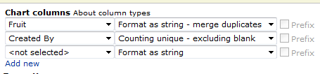
Alexander
Hi Alexander,
you are the best 🙂
Created by Chart ist now working! Perfect!
One question more.
the label of the legend is cut off
like
Hr. ABC…
Hr. DEF…
Hr. XYZ…
How can I display the legend in full?
thanks!
Rene
Try putting the legend above or below the chart.
option:
legend
value:
top or bottom
Alexander
Hi Alexander
First, thank you so much for this great charting solution !!!
You really help me a lot 🙂
Two thing though….
1. I’m trying to modify the text of the chart’s title and the axis data labels by using the configuration options that are listed in the “Google Visualization API”, but it doesn’t seems to work for me – for example trying to set the chart title style so it’ll be blue, Ariel font and font size 10 by adding the option – titleTextStyle = {color: “blue”, fontName: “Ariel”, fontSize: 10}
Can you please tell me what i do wrong here ? Can you please capture an example on how you do it?
2. It appears like some of my site’s users cannot click on the charts elements (meaning that the charts is not interactive for the – the tooltip is not popping). In addition, for several users the tooltip is popping, but then they get a script error and have to close and reopen the site (a simple refresh is not presenting the charts and the script error remains)
Any clue on what can trigger this kind of issue? where should i start digging ?
Many thanks again 🙂
Doron
Hi,
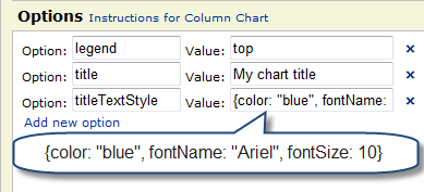
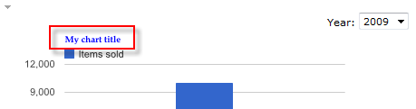
1. I cannot reproduce your problem, i may be the quotes that has to be rewritten – sometimes they are wrong when cutting and pasting code:
2. Which browser are thy using?
Alexander
I believe one problem could be that the font name is “arial”, not “ariel”
My mistake – thank you for noticing.
Alexander
Hi Alex,
have you made any significant changes after version 2.5? That’s the latest that I can get to work within my sharepoint sites. All other versions just do nothing when I set them up like the 2.5.
Chris
Hi, Sorry for the late reply – i have a hard time keeping up with the comments and e-mails…
Have you looked at the change log where you download the code? – there are some new fields that has to be added, other than that i cannot see anything that could brake it?.
Please verify the filenames and ensure you link up the correct files in the CEWP code.
Alexander
No worries, Larry already told me that you are ‘under water’ 🙂 I was just a bit selfish and thought to copy it to the new thread.
Just checked the path and script naming/version/divs/etc again. No avail. The v.2.8.1 and the 2.5 live in the same sub library, when I change the name of the file to the old version it instantly prompts me to generate a config list, when I change it back nothing happens (I cancel the request to have a config list created).
Could the file be corrupt? – try to download it again – if using the “Packer” version, try the other one (and the other way around).
Alexander
Tried that now too. No change. Now my only idea is that there is a problem with CR/LF. I’m downloading the files from your server to my Mac and send them zipped via email to my windows box.
Will check this later and report here.
Hi Alex,
problem still persists, though sending them zipped changed the file size a bit so obviously some spaces/tabs were converted wrongly. I’ll try to investigate more tomorrow.
Chris
Hi Alex,
Once again I would like to thank you for a great end user solution. This is the second time in 2 months one of your solutions have assisted me in filling the void between operational needs and SharePoint out of box capabilities.
I am having some trouble setting a fixed width for the “bars” in a column chart. I tried using the BarFormatter with Option: Width and Value: 25 however, it does not seem to be working. Any thoughts?
Thanks for your help.
After doing some more reading it seems the BarFormatter is intended for Tables only (please correct me if i’m wrong).
I think what I’m looking for is the ability to set “chbh”. I tried using the Options section, but it didnt work.
Hi,
You are right about the BarFormatter (it says “Chart type Table” in the configuration screen…).
I do not think there are any options in the Google API for setting the width of each bar in a Bar-chart.
Alexander
There is a way to set it using chbh= I just don’t know if it can be done through your solution. The issue i’m having is that I have a grpah of completed items by month. Right now we are in April so i only have 3 months worht of completed data. My columns on the graph are very wide right now.
Is there a way I can display all of the horizontal labels even if there is no data for them yet?
I’m afraid you have mixed in parameters from Google Image Charts. This solution uses Google Interactive Charts.
The only way to have a chart with 12 month is to have “placeholders” for the values. Like creating a list with 12 items – one for each month – and have them default to “0” until you have plotted the correct number.
Alexander
You’re right lol I just looked again and i mixed up my parameters I may be able to come up with something from the placeholder idea you suggested. Thanks again.
When one of my filter options has ‘&’ as a value, CAML it is unable to query and gives an error. I tried using as an option, but when hitting save I got ‘Update chart config error: null’. I’m assuming we can’t have any values to filter on that contain ‘&’?
Hi,
This will be fixed in an updated version in a few days.
If the filter is manually created you can replace “&” with
If not you must wait for the new release.
Alexander
Everything works like a charm on sharepoint 2010 foundation,
Even with external content type list (BCS) !
Or you planning to add more types to the script ?
http://code.google.com/intl/nl-BE/apis/visualization/documentation/gallery.html
There is only one thing I could not get to run is the Gauge Chart ?
I used a list with 3 records in it. Is that the problem ? can it hold only 1 record, like 1 string and 1 Number ?
Thanks for sharing this nice script.
Hi,
What visualizations are you missing? – i have only used those provided by Google, not third party.
The gauge chart takes two values – one string and one number.
Look here for an example
I have noticed a few problems using IE9, try turning on compatibility view.
Alexander
Alexander,
Concerning the number of Google chart types. If I am not mistaken there are 22 Google chart types. And 12 in the drop down list of the Chart type.
But this is not that important. More important is the Gauge chart that is not working 🙁
I tried running it in compatibilty mode but no success.
Only a blank page is showing up. All other chart types seem to be doing well.
Did you have a change to test it on your side is it still working ?
Hi,
I was not all that clear in my previous post regarding what chart types I had included. I have used only the ones using “Visualization API”, not the “Charts API”. this has to do with the data policy where the ones using the “Charts API” sends all the data to Google for processing, while the “Visualization API-charts” handles all this locally in the browser.
I have tested the Gauge chart and it works here. If you send me a screenshot or two of the chart config, i can take a look.
Alexander
Hi,
btw can SharePoint be configured to cache list queries (which this tool makes server-side), or could html5 caching somehow be used for this component in the future to minimize the amount of requests to the server? Or what steps I could make to make this as efficient as possible and load as fast as possible while minimizing the network traffic?
..Compared to a basic SP installation with large lists (in a site collection without publishing feature in use)..
Hi,
For now this is a pure client side tool that does not support cashing. There are plenty of server side tools, but they require installation on the server (and may or may not cost money).
Alexander
Hi Alexander,
This is the screenshot for the Gauge Settings
http://s1208.photobucket.com/albums/cc369/ptrex/
I hope is hows what is wrong. After launching this Gauge chart it only shows a blank page with the chart triangle config link at the top left. No grafics.
Looks right to me, does the list have many records? If so, you might want to use “Format as string – merge duplicates” and “Sum” for the number.
If possible, test in another browser to have a reference.
Alexander
The list has 3 records with 2 different sets of data.
Also tested this on 2 platforms Windows 7 x64 and server 2008 x64. And both have everything working fine except the Gauge chart ?
I will try your suggestion.
Did you test it in Forefox or Chrome?
Alexander
Sorry no success 🙁
I think I have to give up.
Thanks for your patience.
Still no go 🙁
I think I have to give up.
Thanks for your patience.
I’m not sure what i’m doing wrong. I have a webpart page with two CEWPs. The top CEWP has the ChartUsingGoogleVisualizationAPI_v2.8.1.js code, and the bottom CEWP has the configuration code. Now I have a page full of code. I’m using SP 2007. Please help!
configuration code:
Hi,
You need only one CEWP. Is the configuration list created by the script?
If not, please check the script references.
Alexander
Yes, it prompted me about the list creation. I removed the additional CEWP and it works! Thanks!!
Laura
Alexander
Haleluja.
It does work using Chrome, not using IE 8.0 !
Patrick
Alexander
I noticed a bug I guess.
when reading a multi page list (records 130) And selecting a view where it will show records 1 / 30.
The chart will only take in account the page 1 values to make the chart / map.
Is that correct ?
I tested this with a GeoMap and using the fields Format as string – Merge Duplicates in combination with Count.
The map only shows the countries on page 1 (records 1 to 30 (ignoring the rest of the records)
This is not a bug. If he view is setup with paging, it will give you the first “block”, just as it will in a list view.
Make another – unpaged – view or use custom CAML.
Alexander
Alexander:
You are the Man!! Using these charts at work (Dashboard/Metrics).
I have a couple of questions:
How do I center the legend on the right side and how do I center the title (top center) using the chart configuration tool?? Any Option/Value I can use to do this? I’m also limited to certain types of software tools…since our PCs at work are so locked down (limitations to software we can install-basically none). Any help would be highly appreciated.
Here are my screen prints:
http://i61.photobucket.com/albums/h72/jp5000/SharePoint/Dashboard_Incidents.jpg
http://i61.photobucket.com/albums/h72/jp5000/SharePoint/Dashboard_Incidents_Chart_Configuration.jpg
Using SP2010
Jim
Hi,
Sorry, but I do not think there are any options for centering the title or the legend in the Google Visualization API. Refer thge API here
Alexander
The org chart indicates that the data is pulled from various calculated columns. Can you show the formula? Thanks.
Hi,
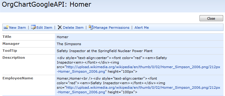

The org chart is built from this list:
The calculated column for EmployeeName:
The “Description” column is plain single line text.
Alexander
Thanks. I had tinkered around a bit and got calc columns that were doing what I wanted, and it wasn’t too difficult to modify them to your set up. So each employee box shows their name (with links to their MySite), Title and picture. I had to set up several calc columns to pull the info that I wanted, because I really wanted something that could be updated without messing with any code. Now I have a problem that the structure of the org chart doesn’t work, all the employees are on a single level.
The following columns are single line text: First Name, Last Name, Job Title, Business Phone, Email Address, Company, Supervisor,
Address , LAN, ImageURL
The following are my calc columns.
OrgChart: =MySite&IF(EmpImg””,”,”&MySite&””&EmpImg,””)
MySite: =CONCATENATE(““,DisplayName,”“)
DisplayName: =CONCATENATE([First Name],” “,[Last Name])
EmpImg: =CONCATENATE(“”,[Job Title],””,””)
update:
MySite column –
a href tag with base url+LAN column showing as the display name
EmpImg column –
Basically your description column starting at the em tag. So, Job Title, img src=ImageURL, and height parameters.
Alexander,
Thanks for the tip !
I made an unpaged view and everything is working fine !
This is realy great stuff !!
One more question regarding CAML queries.
Does this effect the performance in a possitive way on the client side or server side or both ?
Hi,
Custom CAML or the list view is the same. To maximize the performance, have as few items in the dataset as possible. It depends upon the line speed, but large datasets may take a long time to process due to the fact that the “raw” xml has to be downloaded to the client for processing.
Alexander
Alexander,
I ran into an other strange behaviour.
Whenever you edit a Web Part that holds an existing chart. It will get an extra Edit TRIANGLE on the left side ?
http://s1208.photobucket.com/albums/cc369/ptrex/?action=view¤t=292011-04-26.jpg
If you edit it 3 times you will get 3 edit triangles. 4 times you get 4 etc …
Am I doing something wrong ? Or is this a real bug ?
Thanks
My guess is that you have put multiple placeholders/charts with the same ID in the CEWP. It you are using SP2010, try not to put the code directly in the CEWP – place the CEWP code in a textfile alongside the “ChartUsingGoogleVisualizationAPI.js” and link it in using the “Content link” option.
SP2010 messes with the CEWP content if it is put directly in the HTML-editor.
Alexander
hi alex
you charts helping alot for me i add following code in CEWP
arrOfChartContainers = [‘MyChart1’];
google.load(“visualization”,”1″,{packages:[“columnchart”,”barchart”,”areachart”,”linechart”,”piechart”,”OrgChart”]});
google.setOnLoadCallback(onloadInitChart);
function onloadInitChart(){
call_drawChart(arrOfChartContainers);
}
it is having one problem in URL if i select another List the chartcolumns are not coming please help me in that
Hard to tell. Is this true for all lists?
Do you get any error messages in the browser? – what kind of browser do you use?
Alexander
Hi Alexander,
I am using Version 2.8. I am able to create and configure my charts in parent site and related subsites as well.
Can I configure the charts for the lists available at different sites that is not in a sub site. For eg: if currently I am at http://domain/sites/ABC/ then can I configure the Charts for http://domain/sites/XYZ/ ?
I entered the URL of the other site, I could see all the list and views for the specific list. But I dont get the dropdown value for the columns and got the error saying that no table column available.
Please help me on this.
Thanks,
Nitin
Hi,
You can use lists in the same site collection only. It looks like you have multiple site collection in managed path’s and i do not think this will work (i have not tested it though).
Alexander
Hi Alexander,
I was trying to configure the charts from different site collections.
Thanks,
Nitin
Is there any way to chart multi-value columns? Thanks.
Hi,
Do you mean multi choice columns?
These would make a terrible chart as there would be many possible combinations of values and all combinations would make a “record” in the chart.
If you want to try it out, either modify the code for the file “ChartUsingGoogleVisualizationAPI.js” in line 1486. Add “MultiChoice” to the array “arrOfTypesToIncludeInNum” or hand edit the configuration list – this might be hard to interpret though.
Alexander
Nice work Alexander. Congrats!
I would like to implement your charting ui and access to the Google charting API in a corporate sharepoint environment. Does your licensing agreement permit this for free? Does Google allow corporations to use their charting engine for free? I read in the “Google Visualization Program Policy” that the data charted is sent to Google and they keep it for a couple weeks solely for testing and debugging purposes. Is that your understanding too?
Thanks,
Darcy
Hi,
Yes, you can use it for free, but if you are in a hurry to get rid of some money, feel free to donate a few dollars…
The charts created with this solution does NOT send data to Google. All data is processed and rendered in the browser – no data is sent to any server.
Alexander
I’ve attempted to change the colors of a Column Chart (isStacked = true), but when entering the different colors for the different series, only the last series item reflects the color change. For example, under options I have:
series {1:{color:”blue”}}
series {2:{color:”green”}}
series {3:{color:”red”}}
Only the red would be reflected, while the other two series show default colors. Any help on this? Thanks.
Hi,
Use “Option” = colors and “Value” = [“blue”,”green”,”red”]
Alexander
HI,
When making the site as template, iam not able to see the chart displayed.Can you please provide help on this
Hi,
You could not get a site template to have “preloaded” charts due to the fact that the chart configuration uses the list GUID and the view GUID – and the fact that the chart configuration are identified by their relative URL. Both the GUID and the relative URL will change when creating a new site from a template.
This will lead the charts to load the lists from the original location if you try them in a site created from a template.
With the current configuration i do not see a good way of having this work in a site template.
Alexander
Hi all, fairly new to all this stuff, but I’ve followed various posts and instructions as detailed. However, I only ever get to see the code in the CEWP and never seem to get this running.
Is there a simple way of checking to see what’s stopping this from running. I’ve made various changes in terms of paths to the actual API script file in the CEWP content, but that doesn’t seem to kick it off.
Just wanted to clarify that I don’t actually see anything when I come out of edit mode on the page, so it looks like the javascript isn’t executing?
Hi,
The only thing to change in the CEWP code is the
This one must be changed to where your copy of the file resides.
Alexander
“WOW”! This is an impressive tool. Simple to install and intuitive to use.
absolutely stunning.. and perfect timing provided the fact that we have a SP meeting in about 10 mins… 🙂 thanks very much… 10 seconds to down load and 2 mins to implement, simply stunning…
alright … for the benefit of the jr. league’rs here.. would you mind posting an snipit of the code required to have multi charts on a single site? can’t seem to get it to work…
Hi,
Take a look here – i guess you meant multiple charts in one page?
Alexander
thanks! works perfectly! looking forward to what else you might bring to the table…
alright… so we migrated to 2010 and still struggling to get the script to work now.. will not load because of the following error:
Webpage error details
User Agent: Mozilla/4.0 (compatible; MSIE 8.0; Windows NT 5.1; Trident/4.0; SearchToolbar 1.2; .NET CLR 2.0.50727; .NET CLR 3.0.4506.2152; .NET CLR 3.5.30729; .NET CLR 1.1.4322; InfoPath.2; MS-RTC LM 8)
Timestamp: Fri, 15 Jul 2011 15:42:17 UTC
Message: ‘_spUserId’ is undefined
Line: 148
Char: 1
Code: 0
URI: http://workspace.xyz.com/legal/importexport/import/inbound/Shared%20Documents/ChartUsingGoogleVisualizationAPI_v2.9.2.js
p.s…. if you wouldn’t mind redacting the url, i’d appreciate it, thanks.
Fixed.
It appears you are not signed in. This will not (in the current version) work in an anonymous setup. I will look at it and provide a version that supports viewing the charts without signing in.
Alexander
strange… i am signed in … otherwise not really sure how i would edit the pages… no?
OK, then i guess you are on a custom made page not inheriting from the master-page?
Alexander
they are custom pages.. would that cause the conflict? is it possible to redact the if statement completely? seems that this is what is throwing it for a loop… no java expert here but it seems that your if statement is only if in the case that the userid is not defined … i don’t see how that would be the case as all users are defined on our collection…
The variable “_spUserId” is inherited from the master-page and must be defined.
Alexander
ok, i realize your busy and absolutely love that your taking time to discuss this… really quick: i just check the source code on most all the pages and this statement is on each:
var _spUserId=246;
That is strange. If the chart errors out with _spUserId is undefined, and the variable is in fact defined, you must look at the order of appearance. The script with the chart must be put in the lower region of the custom page. This to ensure the necessary pieces have been loaded before it is used.
Alexander
ok, functioning now, to be honest not really sure what i did wrong… with the migration i did have to link to .txt files and in doing so had to delete the old CEWP’s … who knows.. anyway it’s working now… by the way, please delete the url in my comment above if you would be so kind sir, thank you…..
p.s.: all charts with the exception of the gauge chart are working… any ideas as to why the gauge chart would not function? …. thanks very much sir! like i said at the onset this is still a stunning solution, cannot wait to tap some of the other postings you have here…
Hi,
I have already changed the URL.
Try IE8 in compatibility mode.
There are some issues with Internet Explorer and the API – Google’s “Visualization team” are working on it and hopefully it will be better in future versions.
Alexander
pps: the guages are visible on Google’s Chrome browser but not IE8… ha ha…. ha… maybe i’m a cynic but seems to me that this is more than just a coincidence… 🙂 any ideas though?
Hi Alexander!
First of all, great work with the interactive charts!
I have few questions about the Google map chart.
1. Is it possible to disable the street view feature?
2. Is it possible to store html in a column and have it appear in html inside the popup bubble? (links etc.)
3. is there any easy way to build a list or table of links of all the locations, so that when a user clicks on a link, it would automatically be shown on the map? (e.g. http://code.google.com/intl/fi-FI/apis/chart/interactive/docs/gallery/map.html)
Thanks!
Hi,
1. I do not think that is possible. Refer this site http://code.google.com/intl/en-EN/apis/chart/interactive/docs/gallery/map.html
2. Same as nr.1
3. I think you would be better off creating your chart from scratch using the examples in the linked address.
Alexander
Hi Alexander!
Great work! I I just wanted to know if we have the ability to bind the bars, slices of the gauge it self with links.
for example I have a bar chat that shows departments vs the project allocation cost and spending for a given year.
if for any reason the chart shows that there is an excess use of funds for a project or funds are under used. Then user can just click that bar and it will take the user to another page (URL with query) that has all the project details
Is there a way to do this.
also Google has come up with a Dashboard API which is still under experimental development have a look when you have time.
http://code.google.com/apis/chart/interactive/docs/gallery/controls.html#dashboardobject
Regards,
Waqas Iftikhar
Hi,
This might be part of a future release, but I cannot promise anything.
Alexander
Hi Alex,
Thanks for everything, I want to if its possible to make
a custom CAML query which filters the list based on
a Querystring value Parameter form the URL
Thanks
Waqas Iftikhar
Hi,
This is already possible.
I have posted an example here
Alexander
Alexander,
I am trying to restrict “EDIT” access to few of my user groups for the above chart. I went to the configuration list and edited their list permissions to “Read”. Then logged in as one of the users in that group but I still see the edit button and can edit any chart on the page.
Please help. I am in a tight deadline here to proff this out.
Appreciate your help.
Hi,
If restricted, the edit access is granted to all members in the group selected in the dropdown.
If you restrict access to the configuration list itself, the users can still see the configuration, but will get an error when trying to save.
Alexander
Thanks for your quick reply.
Unfortunately it isnt happening in my case. I have a group called “migration team”, when I give only ‘Read’ access to that group in the configuration list, the users in that group can still edit the chart and save it with new values.
I also tried restricting that group in the chart itself (“restrict edit chart acess”) but that still doesnt help. Although that option isnt viable for me as I want to restrict all groups except one. Please advice
Hi,
The group you select is the group that will have edit access. The “rights” are granted based only on membership in the group and has nothing to do with “actual rights”.
Try creating a new group – without any rights assigned – just as a container for those with edit access.
Alexander
Thank You Alexander!!
Giving rights thourgh groups did not work in my case but I was able to restrict edit access on a particular chart via the edit GUI. For now it does what I wanted to.
Thanks again !
Is it possible to change the row limit setting so all records are returned?
Hi,
This solution displays the items from the view you select. If that view has paging, it displays the first batch only – as in a standard SharePoint view.
Set the item limit for your view, or use a custom CAML query.
Alexander
Humm. What I was thinking is that for performance reasons I limit how many records can be retrieved in each view. Plus when looking at a view we don’t necessarily want to see every record. But for charting purposes we might want every record in the view.
I figured out how to override the view row limit by adding result.push( ‘100000’ ) right after the ‘if(paramObj.viewName===undefined){‘ in spjs_wrapQuery but I am still working on figuring out how to add a new setting in the config option and have it saved.
And I tried custom CAML but that did not work. I’m new to SP but when I look at examples for CAML query and SP the option is outside of the CAML query so it does not work when I try in your config?
And btw, fantastic job on this. If you could use it I wrote a tiny script that converts a SP list to a Google DataTable JSON that can be used to make a DataTable. One of the things I did was figure out every combination of column type SharePoint uses to make sure the column type in the DataTable is right (e.g. CC column that returns Date with no time -> date).
Hi,
The custom CAML can be “harvested” from the view (only if the view has filters). Select the desired view, select “Use custom CAML”, and then click “Get CAML from selected view”.
This CAML is an exact replica of the CAML for the view, without the item limit.
I would very much like to see your script. You find my email here
Alexander
I’m not sure what I’m doing wrong… I got the JS loaded and am able to view the part where I should be able to choose some chart columns. I’ve selected my chart time, web, and list. The problem is that the dropdown list does not populate with any names. Any suggestions?
Thanks!
Hi,
Do you get any errors?
Is this the same for all webs and lists?
Do you have rights to the lists you are querying?
Alexander
Unfortunately I get no errors.
I have not been able to choose fields for any web and list.
Yes I have rights to the lists. I even created some new lists and still it’s a no go.
Hi,
There may be a bug with the latest release – try 2.9.2.
Alexander
2.9.2 worked like a champ.
Thanks!
Hi,
I cannot find any errors and need some help.
Could you please test v2.9.3 and turn on the debug console looking for errors.
In IE, hit f12 and select “Console” or “script” – “Start debugging”.
Alexander
OK I think I am a little slow here. I can usually get custom CAML filters to work for me but this time I have a list and I want to create a custom filter to allow users to select any date from the list and show data for that date. Does anyone have an example of how to configure the chart settings for this or at least a link pointing me in the direction of where to look for information. I have been searching the internet now for 4 hours with no luck.
Hi,
There is no interface where you could create such filter. The only option you have would be to create a “manual filter setup” with a set of preselected dates (in iso8601 format).
I do not think this would be much of an option so i must disappoint you here.
Alexander
Need some help…heads up…not a developer but got this running which is a testament to your install and operating instructions.
I am trying to change the overall fontSize of the chart. I tried to via options but may not be calling the correct option.
Figured its a easy answer for this audience so reaching out….thx in advance.
Hi,
Which chart type is it you use?
In general, the option is:
fontSize
and the value is like this:
20
Alexander
Thx Alexander.
I am using bar chart. I clicked on the link beside options and tried your recommendation but don’t see any change to text after.
I tested othe options like option: legend value:none to verify working and that I’m not totally out to lunch and it does.
Send me a screenshot of the configuration and the chart. It works here so i need to see what you are doing.
You find my email here
Alexander
I really liked the article, and the very cool blog
Is there any way to hide the content around the chart other than turning off the editing menu selection? I am showing the chart in a relative div other than the normal way and the menu and item count are taking up space and look out of place.
Hi,
You could turn off the itemcount in the API – the edit menu must be hidden like this:
<style type="text/css">
	#MyChart1_editChartBtn{
		display:none;
	}
</style>
<script type="text/javascript">
if(GetUrlKeyValue('edit')==='1'){
	showEditBtn();
}

function showEditBtn(){
	if($("#MyChart1_editChartBtn").length===0){
		setTimeout(function(){
			showEditBtn();
		},100);
	}else{
		$("#MyChart1_editChartBtn").show();
	}
}
</script>
Append this code to the CEWP.
This code expects the chart container ID to be “MyChart1”. It provided an option to show the edit chart button by passing “edit=1” in the URL like this:
/test/English/Charts/Pages/ByStatus.aspx?edit=1
Alexander
Hello,
im trying to chart a Calendar, i created a Column called “Category”(its a drop-down box with the categorys)
Now i want to create a chart that:
– is a bar chart
– the h axis is “created by”
– the v axis is a the sum of a column that calculate the hours between end and starttime of events (allready solved this with a formular)
– the Bars are grouped by the Creator
– the chart is stacked (allready done)
– the stacked bars show the name of the category
– for each category a specified colour
Did you got any idea i could solve this?
At the moment i got it to work, only 2 Problems persist:
– The colour for each category
– and the categorys with the value of the duration
Could you help me with this Problem, Alexander?
Hi,
I have received your email, but keep in mind that this is a one man effort and i do have many requests and emails. I try to answer all questions, but it may take some time to get to your question.
I have posted the answer to your request in the “Examples-post” here
Alexander
Thanks Alexander,
thats really awesome, its exactly what i was looking for!
By any Chance, is there a way to give specified Categories a specified colour?
Michael
Oh, im so dump…. Im sorry for the Question, after i checked my categorys today if seen that it display all of them, so i just have to add the color-code and everything is working.
Special thanks to you, Alex.
You are one of the best SharePoint JS Guides!
I’m glad you figured it out.
Alexander
Btw is it possible to display exactly the same in a Pie Chart with only 1 Creator.
I try to add the Categorys and the creator and filtered the specified User with CAML, but he cannot display the Piechart.
And is there a way ( im using the Statistic in a Calendar) to refresh the Statistic when you switch to the next or previous week?
I think this isnt that easy to resolve, or?
Hi,
Sorry for the delay, but I’ve had a lot to do lately.
To make this in a pie chart select “Category” as first column – “Format as string – merge duplicates”, then “ID” as second column – “Count”.
To filter by current user, select “Use custom CAML (overrides selected view)” and then “Get filter value from this profile property:ID”.
Use this CAML:
[sourcecode language=""]
<Where><Eq><FieldRef Name=’Author’ LookupId=’TRUE’ /><Value Type=’User’>{}</Value></Eq></Where>
Edit: the last question of yours is not easy to accomplice – sorry.
Alexander
Hello Alex,
thanks for your reply.
the refresh would be great, because i want to check previous and next Weeks on this Calendar too, did you got any idea to solve this Problem?
Btw. Here is the How-To, how i made the Pie-Chart Version:
If tried your Versio, but it doesnt fit my wishes.
So i tried the following:
1. Column: “Category” – Format as String – m,erge Duplicates
2. Column: “Time” – Sum
Costum-CAML:
USERNAME
Its working, i would be just great to have the rights colours for the categorys.
Thanks,
Michael
Hello Alex,
if its not possible to use the Calendar Buttons to jump to the next week, would it be easier to add own buttons to change the Chart to the next or previous week?
Im asking because i added the Charts now to a new site and open it in a modal Window, it would be great to have 1 Buttons with them i could jump to the next week or previous week.
Michael
Hi,
Is this SP2007 or SP2010? I looked at the calendar and if this is SP2007, it might be possible to pull down the value from the URL and use a URL-filter on a calculated column.
Let me know what SP version you are using and i will take a look.
Alexander
Hello Alex,
yes im using SP2010 Foundation. What idea did you got?
Im not sure, its possible to use a calculated column as an URL Filter?
Hi,
I had a typo in my previous comment – as you can see from the updated comment: In SP 2007 it could have been done. In SP2010 however, the calendar is much more complex so i cannot help you with this one at the moment – if I find a reliable method of getting the date range in the calendar view I could come back to it.
Alexander
Hello,
oh, was hoping you got a solution for SP2010.
When i move over the “Next Week”Button on SP he is showing me the information.
Javascript: MoveToDate(‘30.12.2011′,’WPQ1′);
Maybe its possible to request the shown Date before loading the Chart’?
Michael
Hi, The calendar on SP2010 loads asynchronous and i would have to override built-in functions in SharePoint to detect the change of date. I have no solution at the moment. If i find one later on, I’ll let you know.
Alexander
Why would i have a jQuery error out of the blue where it indicates that the query is not able to locate the ListGuid?? When i enter the ListGuid manually to the URL for the one that is causing the error it loads immediately..
Error exactly:
An error occured when running the query for the chart: TC1.
Please check the parameter(s):
ListGuid:
{listguid… }
Have you updated jQuery? – there might be some issues with the latest v1.7 as i haven’t had the time to test it.
Alexander
Hello Alex,
if got a new Question, i allready tried it in serveral Ways but the result wasnt that good.
I need a Chart in my Calendar, the Chart should show the Title of a the Event when the its one of 6 categorys, thats no problem.
i created new columns and used them like the columns for the Time.
But when i “format as string – merge duplicates” the creator and add the columns for the title as “count unique – excluding blank” he is always showing the right Events with the Titles and one bar with all Events merged together as a own point.
Did you got any idea, Alex?
Michael
Hi,
Sorry for the delay, but i have been busy,
I’m not quite sure what you are trying to accomplish here – without having images I’m just guessing, but could you use the “option” isStacked = true?
If this is far out, you could send me some screenshots.
Alexander
It is really nice to have this API with sharepoint. I have a questions now, I am using querystring to get variables then show the pie chart. How could I set defaule value for querystring variables when first time visit the page.
here is my CAML for the paie chart:
{url:Dept}
{url:Dept}
If this pie chart got the variables from querystring, it will show correctly. But every time when first visit the page, it will show a big red box with “The url-filter for “undefined” is missing.” in the box.
I really don’t know how to git rid of this problem.
oh, the CAML code disappear, okay, let me replace the signs,
“Where”
“Or”
“Eq”
“FieldRef Name=Title/”
“Value Type=Text”{url:Dept} “/Value”
“/Eq”
“Eq”
“FieldRef Name=ParentDepartment/”
“Value Type=Text”{url:Dept}”/Value”
“/Eq”
“/Or”
“/Where”
Hope it is working.
Hi,
The intended use for the URL filter is to have a link rigged with the filter value – the user then clicks this link and thus already have the filter in place.
In the current release there is no support for a default value for the filter.
If you use a filter value corresponding with the FieldInternalName of the field you are applying the filter to, the error message will at least be better.
Alexander
For the life of me I haven’t been able to recreate the line chart example shown above. what kind of sharepoint list is required to build a chart showing company performance like in the example?
Chris
This is created from a simple list with three columns: year, sales and expenses.
year sales expenses
2005 10000 8000
Alexander
Thanks, makes sense when you see it 🙂 Now I only have to figure out how to transfer my access data to that type of list but thankfully I know an ‘access master’ 🙂
Chris
Is there a way to get the numeric values for the bar chart to display inside the bars themselves? I know that if I mouse over the bars, the numbers will show but I would like to take a snapshot of the chart with all the values showing.
–Jon
Hi,
This is not supported by the Google Visualization API, sorry.
Alexander
Hello Alex,
after the new year im facing a problem with the dates, the charts doesnt show me the current week anymore, its just showing me the last week, at every chart.
(yeah i know i asked many times for the way to jump to the next week, but thats not that i want to have)
Did you allready noticed this problem?
Its very urgent so i hopefully get a fast answer from you.
Michael
Hi,
I’ll need to see the setup of your char to help you with this one. Send me some screenshots and I’ll take a look.
Alexander
Hello,
i will send you the screenshots in 2 hours, hopefully you will find a solution.
Maybe thats also a solution to change the associated date for the charts 😉
Good Morning Alex,
what Screenshots do you need? Just the configuration of the Charts? Or any special other Pictures?
Michael
The chart configuration with any custom CAML and the chart itself. If you are using a view as source I must have the view filter also.
Alexander
Okay, i sended you 3 pictures, 2 of the config and one of the chart itself.
hopefully you will find something.
Hello,
i will send you the screenshots in 2 hours, hopefully you will find a solution.
Maybe thats also a solution to change the associated date for the charts 😉
Hello Alex,
after all this troubles, i never found a solution for my problem.
But if got another question for now, i think that should be a easy one.
With the Charting Tools of SharePoint 2010 Enterprise, is it possible to build up the some Charts like with your solution?
Michael
Hi,
I have no knowledge of the chart tool in SharePoint Enterprise, sorry.
Alexander
Thanks Alex,
if you found a solution for my problem please tell it to me.
Michael
I would like to limit the data to X data points without creating a new view. Is there a way to implement in custom CAML?
Ah, my tag was removed. Is there a way to implement “RowLimit” in custom CAML?
Thanks.
Hi,
In the current release there are no “API place” to insert an itemlimit without reading from a view.
Alexander
Is there a current location for the code and perhaps consolidated instructions for this capability? So far, I’ve seen a variety of blog entries, references to a web site that no longer responds, etc. so I haven’t been able to locate a currently accessible site to get the code.
Hi,
The link to the code has been updated. I had a redirect from my old server to the new, but this has proven to be a be a bit unstable…
The reason for the many posts on this topic is the fact that it has been updated many times since 2010 when i first posted the solution.
I have not had the time to sum it all up in one post yet, but i have planned to do a post on v3.0 – which i “silently” released in november 2011.
My problem is that i have far to many solutions posted, and far to many questions and feature requests both on existing solutions and updates to support SharePoint 2010 to be able to keep them all updated at all times.
Alexander
Thanks for an excellent code. This saves lot of time and money for most SP developers.
I have a unique requirement, and I am trying to figure out if this can help.
I have a sharepoint list with the following columsn.
US State Code (US-NJ, US-NY ete), Sales Company, Is Active (Boolan)
Every US state can have multiple sales companies
I need to show a US map which shows all the states, when mouse is hovered on a state, the list of Active Sales companies should be shown. Is this possible ?? Can anyone point me to some example that can help me solve this.
Hi,
I’m not sure you can do this by US state codes. You might get it working by using a map and “lat/long” markers to make a pin on each position in the map.
Alexander
Is it possible to query multiple lists and display the data in one chart? I have multiple lists that I would like to rollup into one chart.
Hi,
No, not without modifying the solution to merge multiple datatables. I’m afraid I cannot implement that in this solution.
Alexander
Hi
Forgive me for being a complete novice but I am using the UI version of SP2007 and I have a couple of questions.
What is the ‘CAML’ and is it possible to use when you don’t have access to SPD?
Can someone help me with some code that will generate several google interactive visualisation charts from different list views on one page?
Hi,
This solution does not require access to SPD.
To have multiple charts in one page, modify the CEWP code like this:
Ensure you grab the latest version of the script from here
Alexander
Hi Alexander
I have managed to get this working and I would like to thank you for your amazing hard work and for very graciously allowing it readily available to all.
I wondered if you there was a way to add Column labels to the actual columns or for them to be included in brackets next to the for each of the coordinates of x axis. i.e My x axis consist of employee names and the values are the number of project tasks they have completed. so I would like to see ’employee (x)’ or for (x) to show on the actual column instead of clicking on it. Is this possible to do?
Another question: Is there anyway to add a HTML link to a column, pie or bar chart like you can do with a Org chart?
Many thanks again for your help.
Hi,
I’m glad you like the solution.
Displaying the “label” in the column is currently not possible. I hope the Google chart team will add this later on.
The link can be customized by adding this example function to your CEWP code and tweak it to match your setup:
function chartSelectionHandler(data,chart,chartID){
	var selection, item, x, y, z;
	selection = chart.getSelection();
	if(selection.length>0){
		item = selection[0];
		if(item.row!==undefined){
			x = data.getFormattedValue(item.row, 0);
			if(item.column!==undefined){
				z =  data.getFormattedValue(item.row, item.column)
				y = data.getColumnLabel(item.column);
			}
		}
		if(x===undefined && y===undefined && z===undefined){
			return;
		}
		// Create your filter
		alert("These are the variables you can use for your filter:nnx = "+x+"ny = "+y+"nz = "+z);
		if(confirm("Open filtered list?")){
			if(chartID==='MyChart1'){
				window.open('/test/English/Charts/Lists/ByStatus/AllItems.aspx?FilterField1=Status&FilterValue1='+x,'','width=1000');
			}else if(chartID==='MyChart2'){
				window.open('/test/English/Charts/Lists/Coffee2/AllItems.aspx?FilterField1='+y+'&FilterValue1='+z,'','width=1000');
			}
		}
	}
}
Alexander
I have seen examples for Line Chart using query to access google spreadsheet but could not find a single example for Annotated Timeline or Time Series charts using query
Any help is appreciated.
This solution can query SharePoint lists only. You should ask your question here: http://groups.google.com/group/google-visualization-api
Alexander
Is it possible to use this in conjunction with user input to get the bar graphs? For example, have the data set up in a list and give the user a percentage input and have the bar graph value calculated as a percent of the list value?
This is not possible using this solution.
Alexander
hi Alexander,
have been trying to implement your solution for a while now…
i was successful with the earlier version that came out before version 2.0 and above. that worked fine as i created the config list manually. now with the latest version i can get it to work at all…
i added the 11 line CEWP code in my CEWP even uploaded it to my doc library and referenced it in my CEWP, but nothing is happening…reverting to the earlier versions everything works.
please help…
Hi,
You might have to delete the config list (ore at least rename it to trigger the solution to recreate it).
It might be a problem with the solution if your master page has been modified. Try enabling the console in IE (press f12) to look for error messages.
Alexander
Hi Alexander – I am having trouble selecting a list view. I have been using your application for a while and have several sites with tables on them that call from a list somewhere else. Depending on the site, I would select a view from the chart configuration dialogue box and everything would work. But now the Select View dropdown doesn’t show anything but “”. Even though the views still exist on my list, I can’t see or select them from the configuration dialogue. Any ideas? I don’t think I’ve changed anything. I don’t know why this might happen.
Hi,
Are you using the latest version?
Please ensure your web selector has the correct value as this is used as “BaseUrl” when retrieving the list views.
Alexander
Hello,
I would like to display the total from a Pie Chart. I have tried a couple coding ideas in the Source Code of SharePoint, but those did not work properly. Is there a direct way in the GUI to get this item to display?
Hi, I’m not quite sure what you want to do. If you could provide some more details I might be able to help. Alexander
I would like to see something like this for a pie chart.
from this forum….https://spjsblog.com/2011/05/05/charting-for-sharepoint-using-google-visualization-api-update-05-05-2011/
# 4
Hi
You find this setting in the “edit chart GUI”.
Alexander
Could you please be more specific because I do not see that in my version. 🙁
Is there a variable that I need to set under “Options”?
Hi,

This screenshot is from v3.2. If you are using a version earlier than v2.8.5 you will not find it.
Alexander
Alexander, I found your solution in the book SharePoint 2010 at Work and absolutely everything I’ve done works exactly as it should, so great job! However, I’m still not understanding ‘placeholders’ in other CEWP on the page and how I can make them work to display additional charts so that they can be side by side instead of top to bottom. I have my initial CEWP at the bottom of the page with a link to the CEWP.txt on the site. Only by updating that file can I add the charts and of course, they arrange top to bottom. I’m trying to replace a static chart document that has four rows of charts, two across with a dynamic dashboard. Any suggestions? Feel free to send me off to wherever this might have been addressed before.
Hi,
You find an example in this article
You should upgrade to v3.2 of this tool. You find the link at the top of this article.
Alexander
Alexander,
This was perfect (and life affirming for me as I can’t code my way out of a box and actually figured this out on my own late Friday). The down side is that when I updated to v3.2, no matter how I configured the slices option for my pie charts (primarily using double quotes instead of single), I still got a JSON syntax error. Might this be because I am still using IE7? Please note this is not by choice but is a requirement of my employer.
Thanks again for your help. I know you are busy and your personal attention to questions and problems is appreciated.
Regards,
Barbara
Send me a screenshot of your configuration screen and I’ll take a look.
You find my email here: https://spjsblog.com/about/
Alexander
Is there a way to change the default colors in a Column chart? I’ve been trying to set the array with the following; colors:[‘#FF0000’, ‘#FFFF40’, ‘#00FF00’] and I keep getting an error that says “‘null’ is null or not an object”. Can you help me?
If you are using the latest version I think you will need to replace the single quotes (‘) with double quotes (“) due to JSON parsing.
There is a beta Google Chart Editor. Is it possible a integration between both resources?
I am preparing a column graph which shows probability rate of 100, 90, 80, 70, etc on the x-axis and proposal value on the y-axis.
The probability rate is a number in sharepoint list where the number of decimal place is set to zero.
When i draw the graph using GoogleVisualization, I get 100.00000000000000, 90.0000000000000 on the x-axis. How can I get rid of these extra decimal place? I’ve chosen Format as string – merge duplicates for Probability in the chart configuration
Hi,
Try using the “NumberFormat” option below the “Chart Columns” like this:
[Column Index] : fractionDigits : 0
If this does not help, create a calculated column with this formula:
and use this column in the chart.
Alexander
I can say that this worked (as I had same issue) thanks Alex!
Hi Alex,
I am loving this solution and especially the consume filter from the list view webpart functionality. I was trying to write manual ones but struggled without more examples. Thank you so much for this!
Not sure if you have time to help but I am trying to figure out how to color the columns of my chart depending on a certain % threshold..for example:
>=90%=green
75-89%=yellow
<75%=red
(would be nice to have this in a legend somewhere too).
I am using a basic column chart
Y-axis: Place name
X-axis: Percentage (calculated column)
Many Thanks
Paul
Sorry I should add I think I am halfway there (I can create a calculated column with a formula that says each colour (depending on the %) just not sure how to combine this column to the chart to make it colour the necessary columns.
Thank you for the beer!
Unfortunately this is a bit tricky to accomplice. If you send me a screenshot of your datasource (list view) I might be able to help.
Alexander
Hello,
Thank you for an absolutely great solution. I was able to configure the solution for SP2010 relatively easily. I am looking to create a dashboard with multiple charts. Is it possible to connect the charts together so that clicking something one chart would refresh the other charts based what was selected. Thanks in advance for your help.
Sam
Hi,
You should use v4: https://spjsblog.com/2013/10/02/spjs-charts-for-sharepoint-v4/
You can filter multiple charts using one filter – look at the instructions above the filter textara in the edit chart GUI.
Alexander
Hi Alexander,
Thank you for the quick response. However, I am not able to find the instructions in the edit chart GUI. Am I looking at the wrong place? Can you point me in the right direction, please?
Hi,
You find it under Custom CAML, above the filter textarea.
Alexander
Hi Alex,
Thanks for your quick responses. I am a bit new to the CAML query feature and I have the following scenrio:
1) I have a timeline chart showing the start and end dates of various project activities.
2) I am creating a dashboard that will allow the user to filter the timeline chart using multiple filter values (e.g., project phase, division owner, criticality etc.)
3) I have created lists for each of these filter categories.
4) I have created a web part page and placed the CEWP that constitutes timeline chart.
5) How do I create filters for each of the categories and allow the user to slice and dice the timeline chart based on these filter values?
Additionally, I have a couple of challenges with the timeline chart itself. I keep getting an invalid Argument message right below the little arrow that opens the chart GUI editor. I can send you the screen shot of the GUI editor. Additionally my grid lines do not have any labels.
Any help you can provide will be greatly appreciated.
Hi,
To filter a chart, you must select “Use custom CAML (overrides selected view)”, and then “Create filter(s) above the chart”. Read the instructions above and below the filter textarea.
Regarding missing labels: are you drawing the chart in a hidden container? – if you do, try unhiding the container before drawing the chart.
You can send me some screenshots if you have trouble.
Alexander
How can I change the background color on the table chart? It seems by default, they are white, but I am hoping to control that, or make it transparent.
I still need help on this.
Hi,
The API has a CSS override called “cssClassNames” – read about it here, but you can Use an option like this to your table visualization:
cssClassNames : {"headerRow":"dummyClass"}This dummyClass shall no be defined in the style tag below.
Then add this code to the CEWP:
<style type="text/css">
.google-visualization-table-table, .google-visualization-table-table *{
	border-color:transparent !important;
	background-color:transparent !important;
}
</style>
Your table should now be transparent.
Alexander
Awesome. Works. Thanks so much.